
Neutral homes look effortless when they’re done well. Calm. Warm. Expensive, even. But there’s a very fine line between cozy minimalism and a room that feels flat, lifeless, or strangely unfinished.
A lot of people assume decorating with neutrals is easier because beige matches beige and white goes with everything. But honestly, neutral rooms usually need more layering and detail than colorful ones do.
The secret isn’t adding more stuff. It’s creating depth through texture, contrast, warmth, and variation so the room still feels visually interesting without relying on bold color.
Here’s how to decorate with neutral colors without making your home feel boring.
Mix Different Shades of Neutrals Together
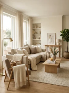
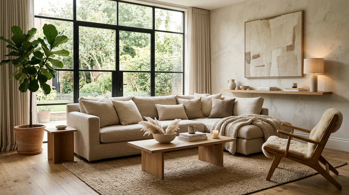
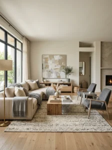
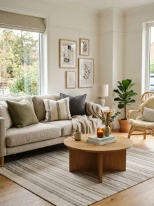
One of the biggest mistakes people make with neutral decorating is choosing everything in exactly the same shade. Rooms start feeling flat very quickly when the walls, furniture, rugs, and decor all blend together without variation. The best neutral spaces layer multiple tones instead. Cream, ivory, oatmeal, taupe, warm gray, sand, camel, and soft white all work beautifully together because they create subtle depth. Even small tonal shifts matter more than people realize. I’ve noticed the coziest neutral rooms rarely feel perfectly matched. They feel collected, soft, and slightly varied in a way that keeps everything visually relaxed.
Use Texture to Add Warmth and Depth
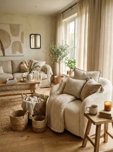
Texture is honestly what makes neutral interiors feel alive. Without it, beige rooms can quickly feel empty no matter how expensive the furniture is. Layering linen curtains, chunky knit blankets, woven baskets, boucle chairs, wood grain, ceramic decor, and soft rugs instantly creates dimension. The room starts feeling warmer without needing bright colors. I personally think texture matters even more in minimalist homes because fewer objects mean every surface becomes more noticeable. A simple cream sofa looks completely different once layered with textured pillows and soft throws. The entire space suddenly feels cozy instead of unfinished or cold.
Bring in Varied Wood Tones
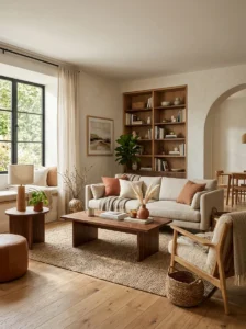
Wood tones quietly add richness to neutral interiors in a way paint colors usually can’t. Rooms with only pale beige furniture often need some natural warmth to stop feeling washed out. Mixing lighter oak, walnut, weathered wood, or medium-tone finishes helps create balance and keeps the space visually grounded. The important part is variation. Matching every wood finish perfectly can sometimes make rooms feel too staged. I love when homes mix a slightly darker coffee table with lighter shelving or woven wood accents nearby. Those subtle contrasts make neutral spaces feel layered, relaxed, and much more designer-inspired overall.
Add a Small Amount of Black for Contrast
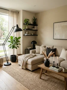
Even soft neutral rooms need a little contrast somewhere. Black accents help anchor the space and keep everything from blending together too much visually. It doesn’t need to be dramatic either. A matte black lamp, picture frame, chair leg, curtain rod, or coffee table base is often enough. Tiny touches make a surprisingly big difference. I’ve noticed neutral rooms instantly feel more polished once darker details are added carefully throughout the space. Without contrast, lighter interiors can sometimes feel blurry or unfinished. Black elements quietly guide the eye around the room while adding depth at the same time.
Layer Soft Fabrics Instead of Flat Surfaces
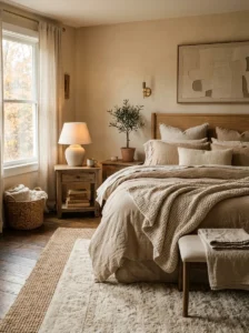
Neutral rooms usually feel more inviting when fabrics look soft and relaxed instead of stiff or overly perfect. Linen bedding, textured throws, oversized pillows, slipcovered sofas, and layered rugs help create that cozy lived-in feeling people love in designer homes. Flat smooth surfaces everywhere can make neutral spaces feel cold surprisingly fast. I personally think layered fabric is what gives homes emotional warmth, not just visual warmth. The room should feel comfortable enough that people actually want to stay there. Slightly wrinkled linen or soft woven textures often look far more beautiful than perfectly styled showroom spaces anyway.
Use Interesting Shapes and Silhouettes
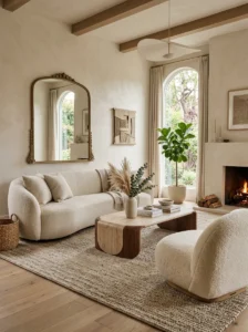
When color palettes stay simple, furniture shapes become much more important visually. Rounded chairs, sculptural coffee tables, curved sofas, arched mirrors, or oversized lighting fixtures help break up the monotony that sometimes happens in neutral rooms. Otherwise everything can start blending together too softly. You don’t need dozens of statement pieces either. Usually one or two interesting silhouettes create enough contrast to make the room feel intentional. I’ve seen even very minimalist homes feel visually exciting once curved furniture or sculptural decor gets added. Shape creates movement, which keeps neutral interiors from looking too predictable or plain.
Mix Warm and Cool Neutral Tones Carefully
A lot of neutral rooms fail because the undertones clash without people realizing why. Some neutrals lean warm while others feel cooler and slightly gray. Mixing them thoughtfully helps spaces feel balanced instead of confusing. Warm whites, creamy beige, camel, terracotta, and honey woods create softer cozy interiors. Cooler grays, charcoal, marble, and black accents feel more modern and sleek. The trick is keeping one undertone dominant while layering smaller contrasts around it. Personally, I think warmer neutrals usually feel more welcoming in homes. Cooler palettes can sometimes start feeling too stark if not softened properly with texture.
Add One Subtle Pattern or Accent Color
Neutral rooms don’t need huge pops of color to feel interesting. Sometimes one soft pattern or muted accent shade completely changes the energy of the space. A striped pillow, vintage rug, muted olive throw, or soft rust-colored artwork can quietly break up all the beige without overwhelming the room. I honestly think subtle patterns work best because they add personality while still keeping the calm atmosphere intact. The room stays neutral overall but gains a little tension and movement. Tiny details like this often make homes feel thoughtfully styled instead of looking too safe or overly minimal.
Let Natural Light Become Part of the Design
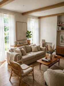
Natural light plays a huge role in how neutral colors actually look throughout the day. Soft sunlight creates warmth, highlights textures, and prevents pale interiors from feeling dull or lifeless. That’s one reason neutral Scandinavian homes often feel so calming. They rely heavily on natural brightness. Sheer curtains, reflective surfaces, lighter walls, and warm-toned fabrics all help maximize light beautifully. I’ve noticed even simple beige rooms can feel luxurious once sunlight moves across textured fabrics and wood finishes. The room almost changes personality during the day. Good lighting honestly does half the decorating work for you.
Make the Space Feel Personal, Not Overstyled
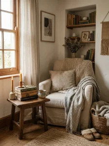
The most beautiful neutral homes usually feel personal instead of perfectly staged. Vintage books, collected ceramics, framed photos, candles, handmade decor, or meaningful objects give warmth and character to soft minimalist interiors. Without personal touches, neutral rooms can sometimes feel more like hotel lobbies than actual homes. I think slight imperfection is important here. A casually folded blanket or uneven stack of books often makes spaces feel more welcoming. Neutral decorating works best when the room still reflects the people living there. Cozy homes always feel layered with personality, not just expensive furniture and matching decor pieces.