
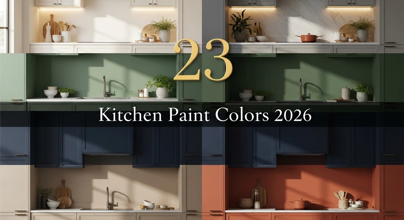
Kitchen color changes everything.
Even a small shift can make the space feel new again.
In 2026, it’s less about bold trends and more about mood.
These colors feel fresh, but still easy to live with.
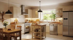
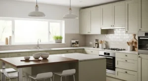
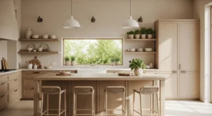
1. Soft Warm White
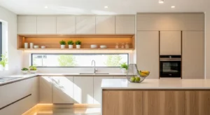
Warm white is no longer stark or cold. It has a subtle creamy undertone that makes kitchens feel softer and more inviting. It works especially well with wood accents and natural textures. And it reflects light beautifully, which helps smaller kitchens feel bigger. You don’t have to overthink styling here. Almost everything pairs well with it. It’s simple, but never boring. Just a clean, calm base that always feels right.
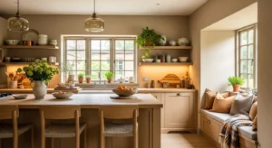
2. Sage Green Calm
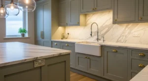
Sage green continues to stay strong in 2026, but with a softer, muted twist. It brings a relaxed, nature-inspired feel into the kitchen. Pair it with brass hardware or light wood for a balanced look. It doesn’t feel loud, but it still adds personality. And somehow, it makes the space feel more peaceful. A good choice if you want color without overwhelming the room.
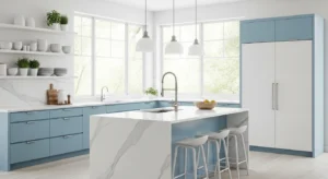
3. Dusty Blue Tones
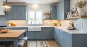
Dusty blue feels calm, but slightly more modern than traditional navy. It has that soft, faded quality that works well in both small and large kitchens. Pair it with white countertops or subtle metallic accents. It adds color, but still feels easy on the eyes. And it creates a quiet, relaxed atmosphere without feeling dull.
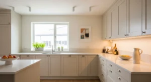
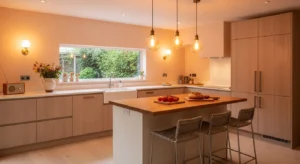
4. Creamy Beige Neutrals
Beige is back, but it’s warmer and more refined now. Creamy tones create a cozy, layered look without feeling outdated. It works beautifully with textured finishes like stone or wood. And it adds warmth that pure white sometimes lacks. This color feels natural and easy, like it belongs in the space.
5. Deep Forest Green
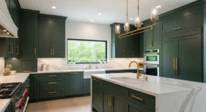
Forest green brings depth and richness into the kitchen. It’s bold, but still grounded. Pair it with gold or brass details for a slightly elevated feel. It works especially well in larger kitchens or spaces with good lighting. The color feels strong, but not overwhelming. And it adds a bit of drama without going too far.
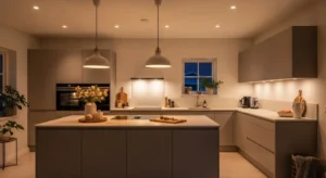
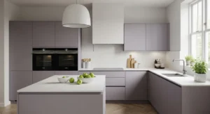
6. Soft Greige Blend
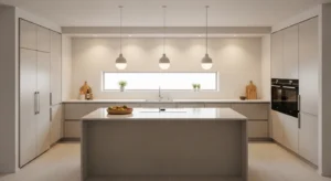
Greige sits perfectly between grey and beige. It’s neutral, but not flat. This tone adapts easily to different lighting conditions. Sometimes warmer, sometimes cooler. That flexibility makes it easy to style. Pair it with both modern and classic elements. It’s subtle, but very versatile.
7. Muted Terracotta
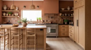
Terracotta is softer in 2026. Less orange, more earthy. It brings warmth and a slightly rustic touch without feeling heavy. Pair it with light cabinets or natural wood. It adds personality without overpowering the space. And it feels grounded and cozy.
8. Pale Olive Green
Olive tones are becoming more popular, especially lighter versions. Pale olive feels fresh and slightly unexpected. It works well with neutral palettes and soft textures. The color adds depth, but still feels calm. It’s subtle, but interesting enough to stand out.
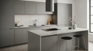
9. Charcoal Grey Depth
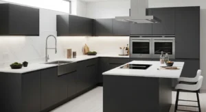
Charcoal grey adds contrast without being too harsh. It’s darker than standard grey, but softer than black. It works well for accent walls or lower cabinets. Pair it with lighter elements to balance it out. The result feels modern and grounded.
10. Warm Taupe Shades
Taupe blends warmth and neutrality beautifully. It sits somewhere between brown and grey. That makes it easy to match with different styles. It adds depth without making the space feel dark. And it works especially well in kitchens with natural light.
11. Soft Blush Accent
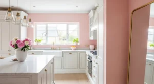
Blush tones are subtle, but they bring a soft warmth to the kitchen. Not overly pink. Just a hint. It works best as an accent rather than a full wall color. Pair it with neutrals to keep things balanced. It feels fresh and slightly different.
12. Navy Blue Classic
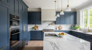
Navy remains a strong choice, but with softer finishes. Matte or satin works best. It adds depth and contrast while still feeling classic. Pair it with white or marble for a clean look. It’s bold, but still very livable.
13. Light Mushroom Tone
Mushroom tones are quiet and understated. A mix of grey, beige, and brown. It creates a soft, earthy feel. This color works well with natural materials and minimal decor. It doesn’t draw too much attention, but it makes the space feel complete.
14. Sky Blue Freshness
Sky blue feels light and refreshing. It brings a sense of openness into the kitchen. Especially in spaces with good natural light. Pair it with white for a clean, airy look. It’s simple, but uplifting.
15. Matte Black Accent Walls
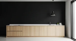
Black can work in kitchens, especially in small doses. A matte finish keeps it from feeling too harsh. Use it as an accent wall or in small sections. It adds contrast and a modern edge. Balance it with lighter tones to keep things open.
16. Warm Sand Tones
Sand tones feel soft and natural. They add warmth without being too dark. Perfect for creating a relaxed atmosphere. Pair with wood or woven textures. It keeps everything feeling light and grounded.
17. Soft Lavender Grey
Lavender grey is subtle but unique. It adds a slight hint of color without being obvious. In certain lighting, it feels neutral. In others, a bit more playful. It’s a gentle way to try something different.
18. Off-White with Undertones
Off-white shades bring more character than plain white. Slight undertones make the space feel warmer. It’s a small difference, but noticeable. And it works well in almost any kitchen style.
19. Deep Teal Statement
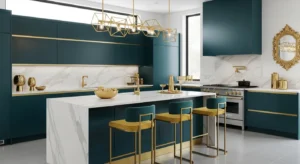
Teal adds depth with a bit more personality than navy. It feels rich and slightly bold. Best used in balanced amounts. Pair with neutral elements to keep it grounded. It stands out, but still feels refined.
20. Soft Peach Warmth
Peach tones are making a quiet comeback. Soft, muted versions feel warm and inviting. Not too bright. Just enough to add a glow. It pairs well with light woods and neutral decor. It feels gentle and cozy.
21. Cool Ash Grey
Ash grey feels cooler and more modern. It works well in sleek kitchens with minimal decor. Pair it with metal finishes or glass elements. It keeps the space feeling sharp and clean.
22. Earthy Clay Tones
Clay tones bring depth and warmth. They feel grounded and natural. Perfect for creating a cozy kitchen environment. Pair with soft lighting and natural textures. It feels inviting without being too dark.
23. Soft Butter Yellow
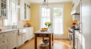
Butter yellow adds a gentle brightness. It’s soft, not overpowering. And it brings warmth into the kitchen. Pair it with white or light wood. It feels cheerful, but still calm.