
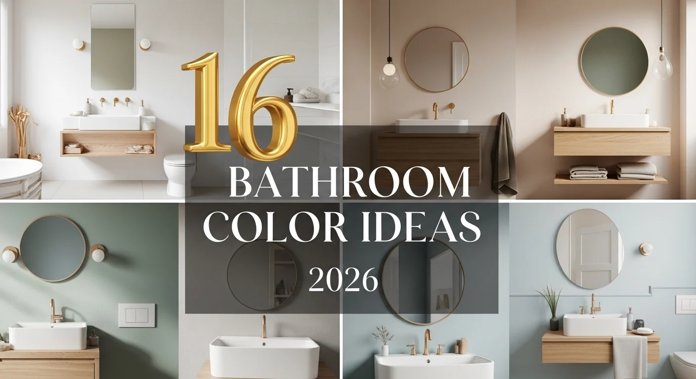
Color can change the whole bathroom.
Even small updates feel noticeable.
In 2026, it’s all about clean tones with a bit of warmth.
Simple, but not boring.
1. Soft Warm White Walls
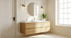
Warm white feels softer than bright white. It reflects light beautifully, but doesn’t feel harsh. That makes the bathroom look clean without feeling cold. Pair it with light wood or beige accents for balance. It’s easy to style and works in almost any space. Small or large, it always looks fresh. And it never goes out of style. Just simple, clean, and comfortable.
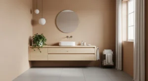
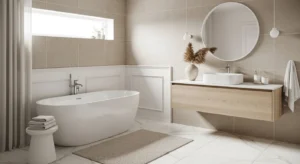
2. Light Beige Neutral
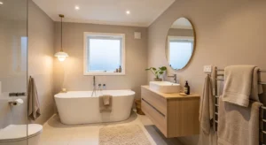
Beige is coming back, but in a more refined way. Lighter tones feel warm and inviting without looking outdated. It works especially well with natural materials like stone or wood. And it softens the overall space. The result feels calm and easy to live with. Not too bright, not too dark. Just balanced.
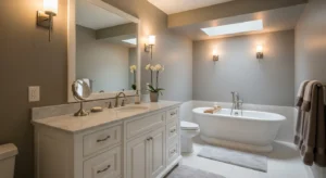
3. Soft Grey with Warm Undertones
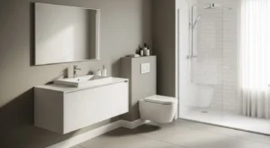
Grey isn’t gone, it’s just warmer now. Soft greys with a hint of beige feel more modern. They keep the clean look but add a bit of warmth. It’s a subtle shift, but noticeable. Pair it with white fixtures for contrast. And maybe a touch of wood. It keeps the space from feeling flat.
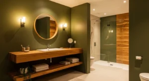
4. Sage Green Calm
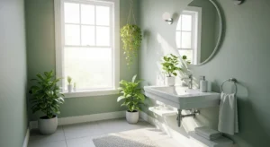
Sage green brings a quiet, natural feel into the bathroom. It’s soft, not overpowering. And it pairs beautifully with white or cream tones. Add plants or wood details to enhance the look. It feels fresh, but also relaxing. A great option if you want a bit of color without losing that clean vibe.
5. Creamy Off-White
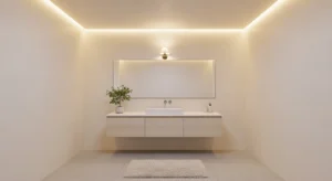
Off-white tones add more depth than pure white. Slight undertones make the space feel warmer. It still looks clean, but less stark. And it works well with both modern and classic designs. Add soft textures for a layered look. It’s subtle, but very effective.
6. Pale Blue Freshness
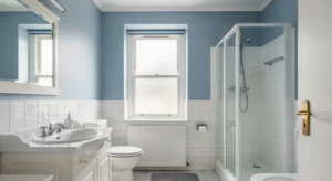
Pale blue brings a light, airy feeling. It reminds you of water and sky. And it works especially well in bathrooms with natural light. Pair it with white fixtures for a clean finish. It feels fresh without being too bold. And it creates a calm, open atmosphere.
7. Taupe and Neutral Blend
Taupe sits somewhere between grey and beige. It adds depth while staying neutral. That makes it easy to style with different textures. Use it on walls or cabinets. It keeps the space feeling modern, but still warm. And it doesn’t overpower the room.
8. Soft Olive Green
Olive green is slightly deeper than sage, but still calm. It adds a natural, grounded feel. Pair it with warm lighting and neutral tones. It creates a cozy atmosphere. And it feels a bit more unique than standard neutrals. Subtle, but interesting.
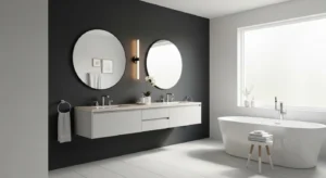
9. Crisp White with Black Accents
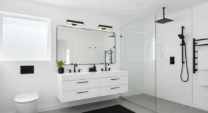
White with black details creates a clean contrast. It feels sharp and modern. Use black in small ways—fixtures, frames, or hardware. The balance is important. Too much can feel heavy. But just enough adds structure. And keeps the design interesting.
10. Warm Sand Tones
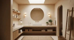
Sand tones bring softness into the space. They feel natural and slightly warm. Perfect for creating a relaxed bathroom. Pair them with wood or woven textures. It keeps everything feeling light. And not overly styled.
11. Dusty Blue-Grey Mix
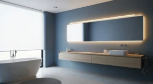
This color sits between blue and grey. It’s soft and slightly muted. It adds color, but still feels neutral. Perfect for a modern bathroom. Pair with white or light wood for balance. It feels calm and understated.
12. Light Mushroom Shade
Mushroom tones are subtle and earthy. A mix of beige, grey, and brown. It creates a soft, layered look. And it works well with natural materials. The space feels calm and cohesive. Not too bright. Not too dark.
13. Soft Blush Accent
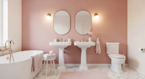
Blush tones can work in small amounts. They add warmth without being too noticeable. Use it as an accent wall or in decor. Pair with neutral tones to keep it balanced. It feels soft and slightly different.
14. Charcoal Accent Wall
A dark accent wall adds contrast. Charcoal is softer than black, but still bold. Use it in one section only. And keep the rest of the space light. It creates depth without overwhelming the room.
15. Warm Terracotta Touch
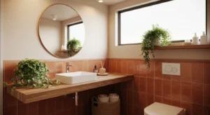
Terracotta adds a natural warmth. It feels earthy and grounded. Use it in small areas or accents. It pairs well with neutral tones. And it brings a bit of personality into the space.
16. Neutral Mix of Beige and White
Mixing beige and white creates a layered neutral look. It feels soft and balanced. Not flat. Use different shades across walls, tiles, and decor. It adds depth without using bold colors. And it keeps the space feeling clean and modern.