
Choosing the right paint color for your living room is one of the most important design decisions you can make for your home. Your living room is the heart of the house — it’s where you relax after a long day, entertain guests, spend time with family, and create memories. The paint color you choose can completely change how the room feels, looks, and functions. Some colors make a space feel bigger and brighter, while others create a warm and cozy atmosphere.
With thousands of paint shades available today, picking the perfect one can feel overwhelming. That’s why it’s important to understand a few simple design principles before making a final decision. From lighting and furniture to undertones and room size, many factors affect how a paint color looks once it’s on your walls.
In this guide, we’ll explore detailed and practical tips to help you confidently choose the best living room paint color for your space.
Start With the Mood You Want to Create
Before you start browsing paint samples or visiting the paint store, take a moment to think about the feeling you want your living room to have. Paint color is not just about appearance — it directly affects the mood and energy of a room. Some colors create a peaceful and relaxing environment, while others make a space feel energetic, dramatic, elegant, or cozy.
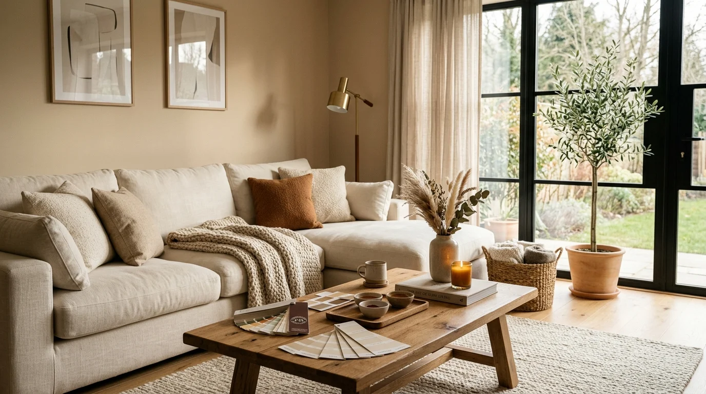
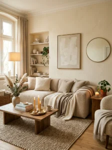
For example, soft white, cream, and light beige shades usually create a calm and airy atmosphere that feels welcoming and timeless. These colors are perfect if you want your living room to feel open, bright, and relaxing. On the other hand, deeper shades like navy blue, charcoal gray, forest green, or dark brown create a more luxurious and dramatic feeling. These darker colors often work beautifully in modern or sophisticated interiors.
You should also think about how you use your living room every day. If it’s a busy family space where everyone gathers, warm and comfortable colors may work best. If it’s a formal entertaining area, you might prefer something more polished and elegant.
The mood you want should always guide your color choice because the right paint color can completely transform the personality of your living room.
Consider Your Existing Furniture and Decor
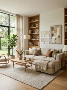
One of the biggest mistakes homeowners make is choosing paint colors before thinking about their furniture, flooring, and decor. Your living room paint should work together with all the major elements already in the space. Sofas, rugs, curtains, coffee tables, artwork, flooring, and decorative accessories all influence how paint colors appear in the room.
For example, if your furniture has warm wood tones, beige fabrics, or earthy textures, warm paint colors usually look best because they create harmony throughout the space. Cool gray paint may clash with warm furniture and make the room feel disconnected. Similarly, if your living room includes black furniture, silver accents, or modern decor, cooler shades like crisp white, gray, or soft blue may complement the space better.
Patterns and textures also matter when choosing paint. If your room already contains bold rugs, colorful pillows, or statement artwork, neutral wall colors can help balance the design. But if your furniture and decor are simple and minimal, adding a richer wall color can create visual interest.
Instead of choosing paint first and forcing everything else to match later, design experts recommend selecting your large furniture pieces first and then choosing a paint color that complements them beautifully.
Understand How Lighting Affects Paint Colors
Lighting plays one of the most important roles in how paint colors appear inside your living room. A color that looks perfect in the paint store can look completely different once it’s painted on your walls at home. Natural sunlight, ceiling lights, lamps, shadows, and even the direction your windows face can dramatically change how a color looks throughout the day.
Rooms with large south-facing windows usually receive warm natural light, which makes paint colors appear brighter and softer. North-facing rooms often have cooler and darker lighting, causing some colors to look dull or gray. East-facing rooms tend to get bright morning light, while west-facing rooms feel warmer during the evening hours.
Artificial lighting matters too. Warm yellow light bulbs can make beige or cream paint look richer and warmer, while cool white LED lights can make the same paint appear crisp or slightly gray. Because of this, it’s never a good idea to choose paint based only on a small paint chip under store lighting.
Always test samples directly on your walls and observe them during different times of the day. Morning sunlight, afternoon brightness, cloudy weather, and nighttime lighting can all affect the final appearance. Understanding lighting helps you avoid choosing a color that later feels too dark, too bright, or completely different than expected.
Choose the Right Color Family
After deciding on the mood and understanding your room’s lighting, the next step is choosing a color family. A color family simply means the general group of shades you want to work with, such as whites, grays, blues, greens, beige tones, or earthy neutrals. Choosing a color family first makes the entire process much easier because it narrows down your options and prevents overwhelm.
Neutral paint colors remain the most popular choice for living rooms because they are versatile and timeless. Warm whites, creamy beige shades, and soft greige tones work beautifully in many home styles, from modern and minimalist to farmhouse and traditional interiors. These colors also make it easier to update furniture and decor later without repainting the walls.
If you want a little more personality, muted greens, dusty blues, or soft terracotta shades can add warmth and character while still feeling elegant and sophisticated. Darker colors like navy blue or deep olive green can create a cozy luxury atmosphere, especially in larger living rooms.
When choosing your color family, think about your long-term style goals. Trendy colors may look exciting today, but timeless shades often age better and provide more decorating flexibility in the future.
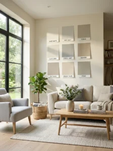
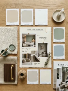
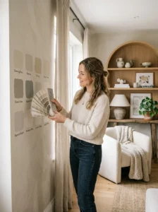
Test Paint Samples Before Making a Final Decision
Testing paint samples is one of the most important steps in choosing the right living room paint color. Many people skip this step and end up disappointed after painting the entire room. Paint almost always looks different on a large wall compared to a tiny paint chip or online photo.
Once you narrow your options down to a few shades, purchase sample paints or peel-and-stick swatches and test them in your living room. Apply the samples to multiple walls because lighting changes from one side of the room to another. A color that looks soft and beautiful near the window may appear dark or dull in another corner.
It’s also important to leave the samples up for several days before making your decision. Observe how they look during different times of the day and under different lighting conditions. Morning sunlight, cloudy weather, and nighttime lamps can all completely change the appearance of a color.
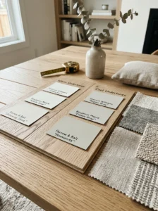
Many professional designers recommend viewing paint samples next to your furniture, flooring, curtains, and decor to see how everything works together. This helps you notice undertones and avoid unexpected clashes.
Taking extra time to test samples carefully can save money, time, and frustration while helping you feel confident in your final paint choice.
Pay Attention to Undertones
Undertones are the subtle hidden colors underneath the main paint shade, and they have a huge impact on how paint looks in your living room. Two beige paint colors may look almost identical at first glance, but one could have pink undertones while another has yellow or green undertones. These hidden tones become much more noticeable once the paint is on your walls.
Understanding undertones is important because they affect how well your paint coordinates with furniture, flooring, cabinets, trim, and decorative elements. For example, cool gray paint with blue undertones may clash with warm wood flooring or cream-colored furniture. Similarly, warm white paint with yellow undertones might make bright white trim appear dirty or dull.
Natural lighting can also make undertones stronger throughout the day. A paint color that seems neutral in the store may suddenly appear green, purple, or blue once sunlight hits the walls in your home.
The best way to identify undertones is by comparing paint samples side by side. This makes subtle differences easier to notice. You should also test samples near permanent features in the room, such as fireplaces, flooring, countertops, or large furniture pieces.
Paying close attention to undertones helps create a balanced and professional-looking living room that feels cohesive and visually comfortable.
Think About the Size of Your Living Room
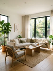
The size of your living room can also help determine which paint colors will work best in the space. Different shades can visually change how large or small a room feels. Light paint colors generally make spaces appear bigger, brighter, and more open, while darker shades tend to create a cozier and more intimate atmosphere.
If you have a small living room, lighter colors like soft white, cream, pale gray, or warm beige can help reflect light and make the room feel larger. These shades create an airy feeling and prevent the walls from feeling closed in. Mirrors, natural light, and minimal decor can further enhance this spacious effect.
However, darker colors are not always a bad choice for smaller rooms. Deep green, charcoal gray, or navy blue can actually make a small space feel dramatic, cozy, and stylish when paired with proper lighting and decor. Large living rooms often benefit from richer tones because darker colors help the space feel warmer and less empty.
Ceiling height matters too. Lighter ceiling colors can make ceilings appear taller, while darker shades create a more intimate feeling. Understanding how paint affects visual space can help you create a living room that feels balanced, comfortable, and perfectly suited to your home’s layout