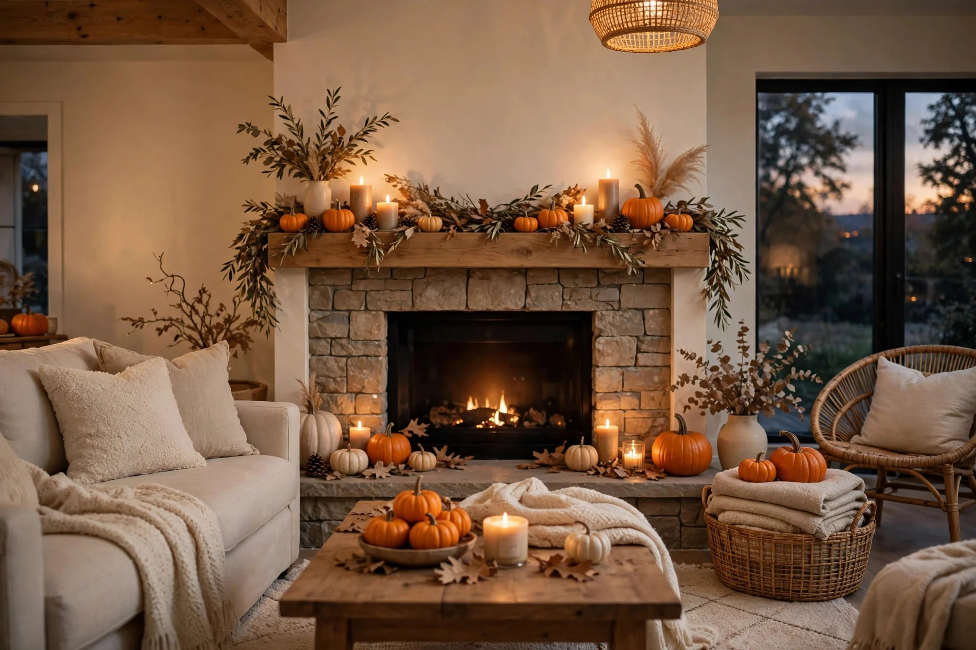
Every October I have the same argument with myself, and it starts in the pumpkin patch. Do I go full classic Halloween — the orange pumpkins, the black cats, the whole gloriously loud orange-and-black thing — or do I keep it calm and neutral, all cream pumpkins and candlelight, the kind of look that would not embarrass my living room in November?
For years I treated it as an either-or choice, and for years I got it wrong in both directions. One year I went all-in on orange and black and my living room looked like a costume shop exploded. Another year I went so neutral that nobody could tell it was Halloween at all, and my kids asked, genuinely confused, whether we were skipping it this year. The truth I eventually landed on is that neither look is better. They just suit different homes, different budgets, and different Octobers.
This is the honest comparison I wish someone had handed me before I bought my third box of decorations I never used again: what each look actually costs, how long it lasts, who it works for, and how to pick the right one for your house this year — including the option of doing a bit of both.
1. The Classic Orange-and-Black Look: When It Shines
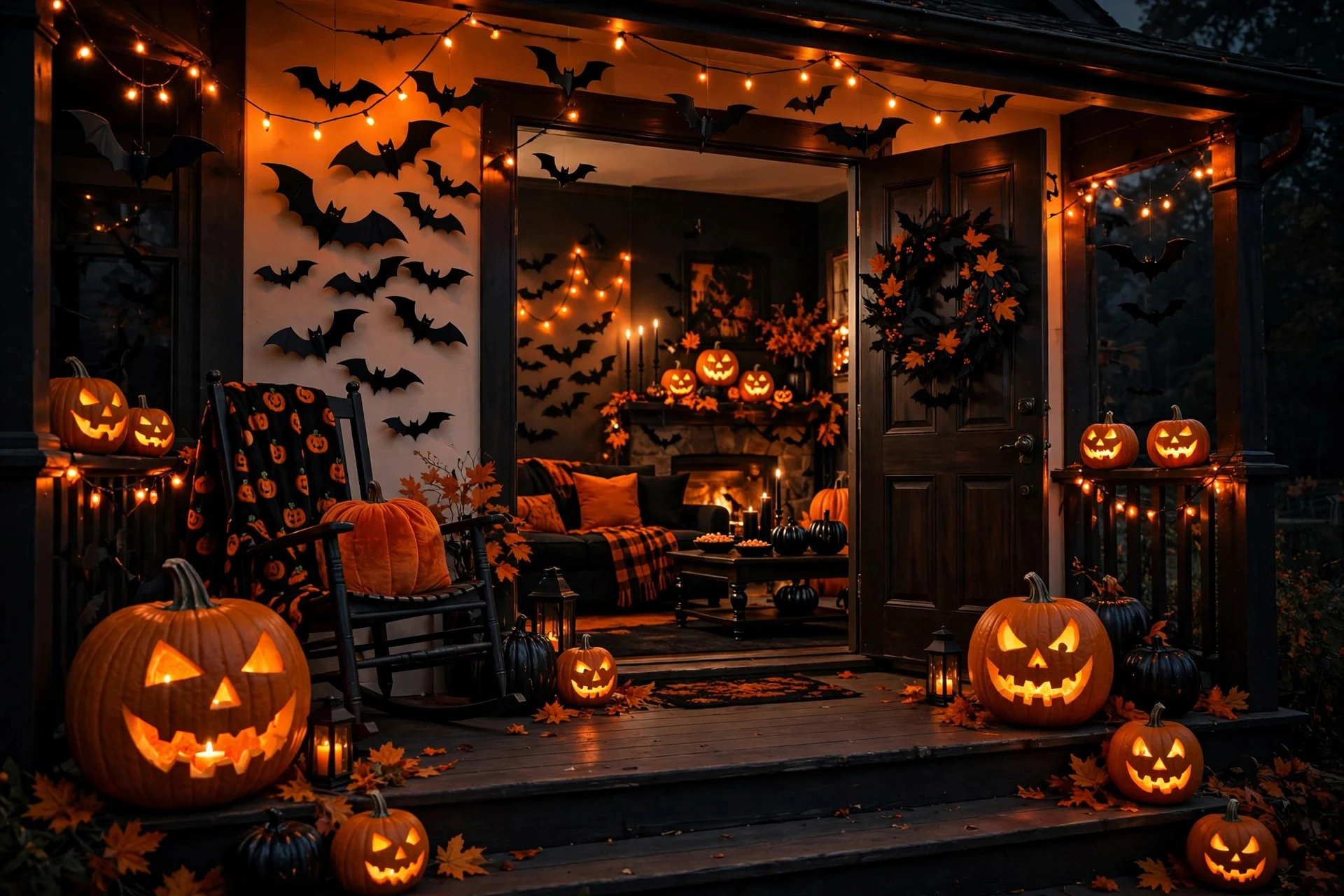
Orange and black is Halloween in its purest form. It is the look most of us grew up with: carved jack-o-lanterns grinning on the porch, black paper bats on the windows, orange string lights, and a bowl of candy that empties itself by eight o’clock. It is loud, cheerful, and instantly readable from the street, which is exactly the point.
This look shines brightest when kids are involved. If your house gets trick-or-treaters, orange and black is practically a signal flare that says “we are in, come knock.” Children do not care about tasteful muted tones. They care about the pumpkin with the goofy face and the porch that looks like fun. It also shines when your home already leans warm and traditional — wood floors, earthy furniture, a brick fireplace — because orange sits naturally in that palette instead of fighting it.
The other advantage nobody talks about is price. Orange and black is the cheapest Halloween look to build, because it is what every store stocks in bulk. Pumpkins are cheap, black construction paper costs almost nothing, and dollar-store Halloween decorations are almost entirely orange and black by default. If you are decorating on a tight budget or for a single big party night, this is the look that gives you the most drama per dollar.
Where it struggles is staying power. Real carved pumpkins last about a week before they sag, and the whole look is so tied to October 31st that it feels wrong on November 1st. If you like to decorate early and take things down slowly, orange and black can start to feel tired by the third week of the month.
2. The Neutral Halloween Look: Creams, Blacks, Wood, and Muted Tones
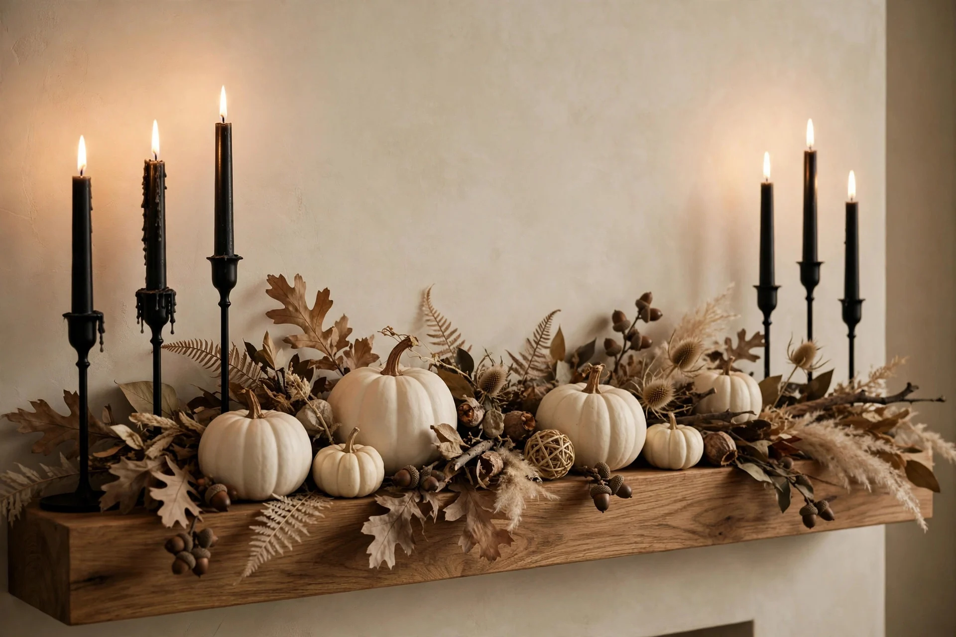
Neutral Halloween is the quieter cousin: cream and white pumpkins, matte black accents, natural wood, dried leaves, linen, and candlelight instead of neon orange. Nothing screams. Everything glows. It is the look you choose when you want your house to feel like autumn with a spooky edge, rather than a haunted house.
This look works beautifully in modern, minimal, or farmhouse-style homes where a bright orange explosion would clash with everything else in the room. If your living room is mostly whites, greys, and wood, cream pumpkins and black candle holders slot right in without demanding you redecorate the whole space around them. It also photographs beautifully, which matters more than people admit when the mantel is the backdrop for every family photo that month.
The biggest practical win is longevity. Faux cream pumpkins, dried foliage, and black lanterns do not expire. You can put them out in late September, leave them through Thanksgiving with a few tweaks, and pack them away in one box that you will genuinely reuse next year. I have a set of white ceramic pumpkins I have used for four Octobers now, and they still look brand new. Try that with a real carved pumpkin.
The risk is going too far. Neutral Halloween done badly just looks like regular autumn decor with a black candle thrown in, and guests will not know you meant it as Halloween at all. The fix is usually one or two clearly spooky pieces — a black cat figure, a crow, a set of painted no-carve pumpkins with simple faces — so the room reads as Halloween, not just fall.
3. Orange-and-Black vs. Neutral, Side by Side
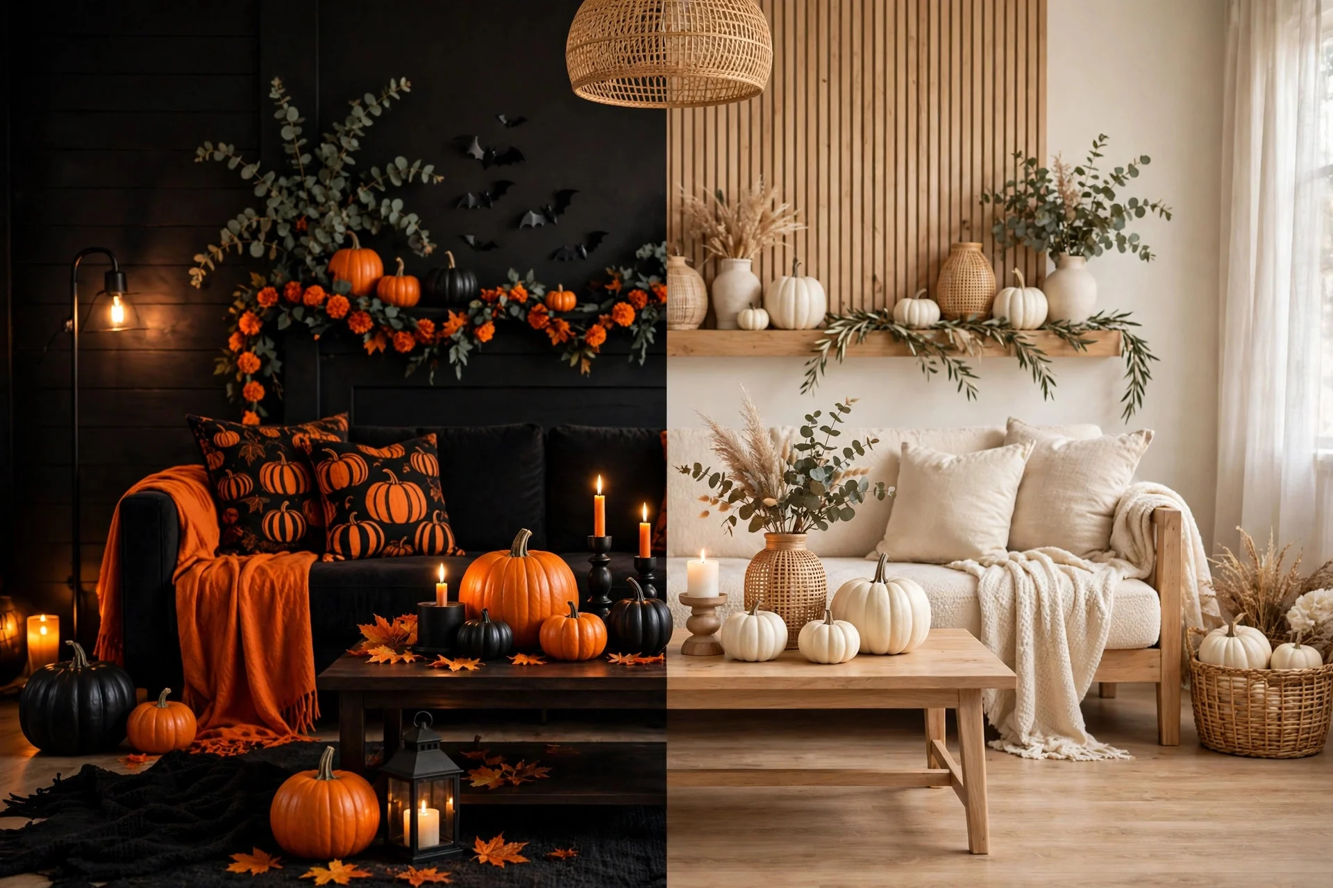
Put the two looks next to each other and the trade-offs get clear fast. On mood, orange and black is festive and playful; neutral is calm and grown-up. Neither is wrong, but they set completely different expectations for anyone walking through your front door. A kid expecting a spooky party will be confused by a whisper-quiet neutral porch, and a dinner guest expecting an elegant evening will be startled by a porch full of screaming inflatables.
On cost, orange and black wins the first year and loses over time. It is cheap to buy but mostly disposable: real pumpkins rot, paper decorations tear, and orange string lights rarely survive a second season in the attic. Neutral costs more up front — a good faux pumpkin is not cheap — but it pays for itself by year two or three because almost everything comes back out of the box next October.
On longevity, neutral wins outright. It stretches from late September to Thanksgiving without looking out of place, while orange and black has a hard expiry date of November 1st. And on kid-friendliness, orange and black wins just as clearly. Kids love bright, obvious, silly-spooky. Neutral Halloween can feel like a museum to a seven-year-old, and if your October is mostly about your kids, that matters more than any design principle.
So the real question is not which look is better. It is which October you are having: a kid-focused, party-heavy, budget-first October, or a slower, grown-up, design-led one. Most of us have a bit of both, which is why the answer for a lot of homes ends up being a mix.
4. Room by Room: Porch, Living Room, Mantel, and Table
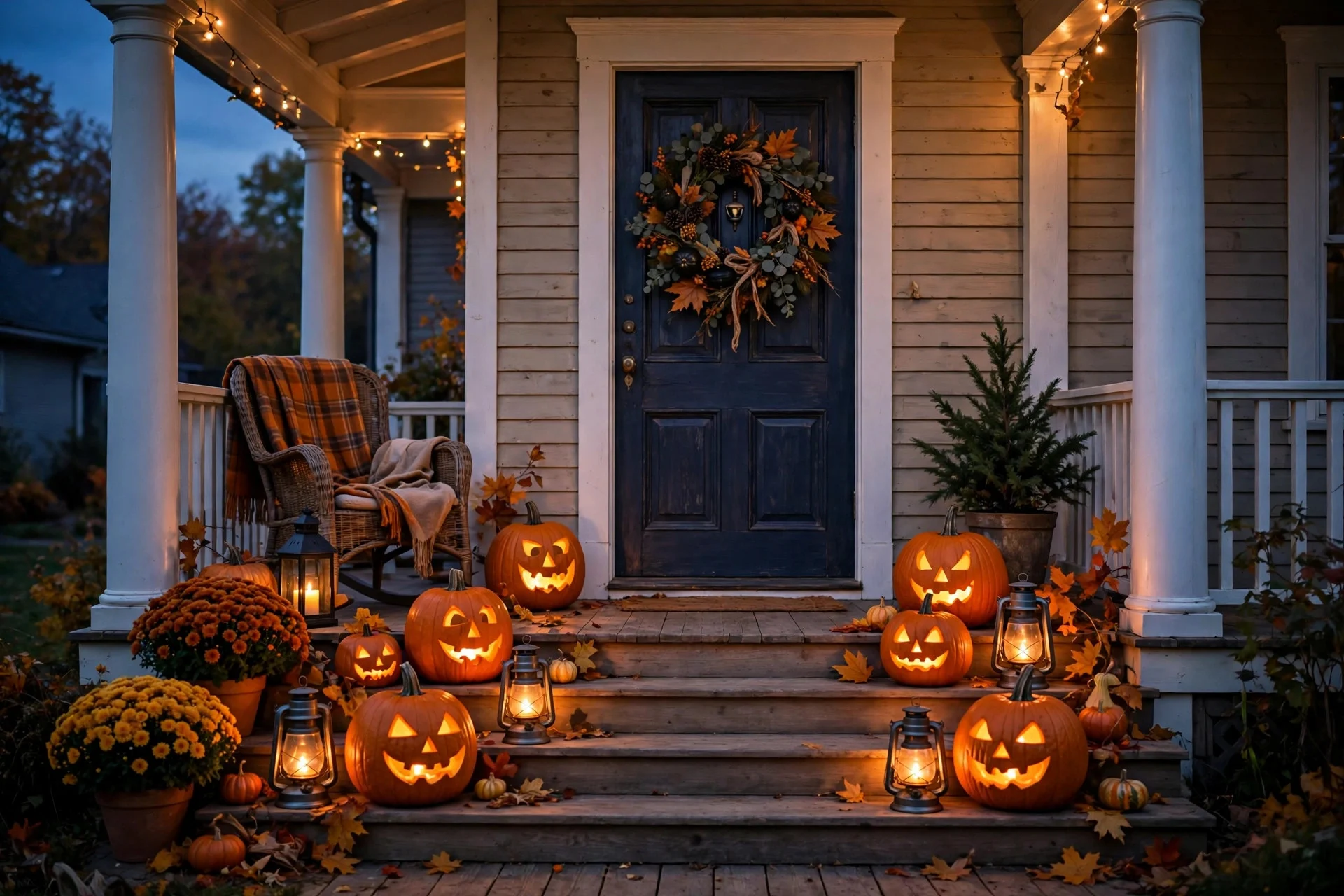
The porch is where orange and black earns its keep. This is the one spot I would almost always go bold, even in an otherwise neutral house, because the porch is a public signal. Trick-or-treaters, neighbours, and delivery drivers all read it in two seconds. A couple of carved or painted pumpkins, a lantern, and a wreath are enough; if you are short on time, last-minute porch ideas can pull the whole thing together in an afternoon. Going neutral on the porch is fine too, but use at least one clearly Halloween piece — a black lantern, a crow — so it does not read as plain autumn.
The living room is where neutral usually wins. This is the room you actually live in all month, and a full orange-and-black takeover gets visually tiring by week two. Keep the big furniture and textiles as they are, then layer in the season: cream pumpkins on the coffee table, a black throw, a few candles. If you want the classic energy, confine it to one corner or one shelf instead of the whole room.
The mantel is your showcase, and it is the best place to mix both looks, because a mantel is a contained stage. A row of mixed pumpkins — orange, cream, and black — with candles and dried foliage reads as intentional rather than confused, as long as you keep one colour dominant. I do roughly two-thirds neutral with a few orange pops, and it is the most complimented spot in my house every October.
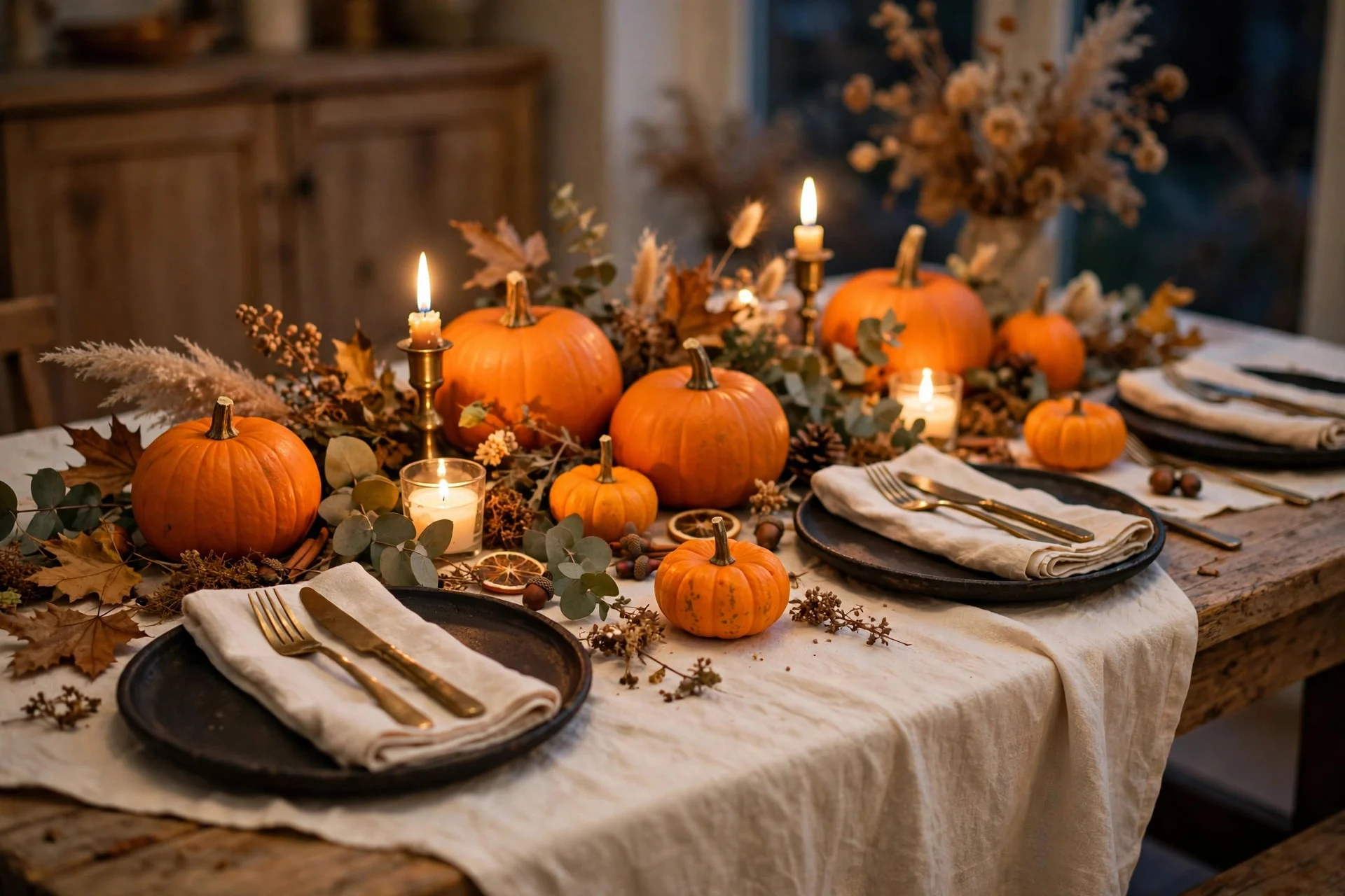
The table is where the occasion decides. A kids’ party table wants orange and black: bright napkins, silly cups, a pumpkin centrepiece. An adult dinner wants neutral: black plates, cream linen, candlelight, maybe one small pumpkin per setting. If you are hosting adults, grown-up Halloween table settings will get you further than anything orange and plastic.
5. How to Mix Both Without Clashing
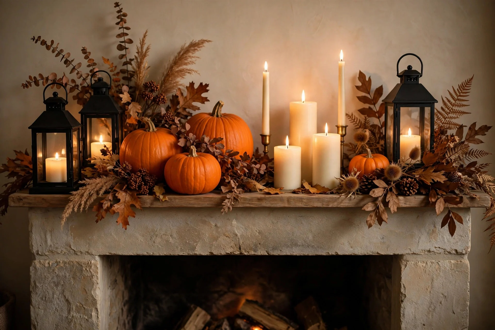
Mixing works when you follow one rule: pick a dominant look and let the other one accent. A room that is half orange and half neutral just looks undecided. A neutral room with three bold orange pumpkins looks deliberate. An orange-and-black porch with one cream pumpkin and a black lantern looks curated. The ratio matters more than the individual pieces.
Black is your bridge colour, because it exists in both looks. Black candle holders, a black lantern, or a black table runner can sit comfortably next to orange pumpkins and cream linen at the same time, and they stop the two palettes from arguing with each other. Wood does the same job: a wooden tray, a basket, or a cutting board under your pumpkins warms up both styles at once.
Keep the bright orange to a few focal points rather than spreading it everywhere. One cluster of orange pumpkins on the porch, one orange throw pillow in the living room, one orange candle on the table. When orange is an accent instead of a flood, it pops against the neutral background instead of overwhelming it. And repeat at least one element — the same black lantern on the porch and the mantel, for example — so the house feels connected rather than like four separate decorating decisions.
If you are starting from scratch and unsure, buy neutral first. Cream pumpkins, black lanterns, and dried foliage will serve you for years and for Thanksgiving too. Then add a small amount of orange each year — a few real pumpkins, some orange candles — and you get the classic energy without committing the whole house to it.
6. Mistakes to Avoid
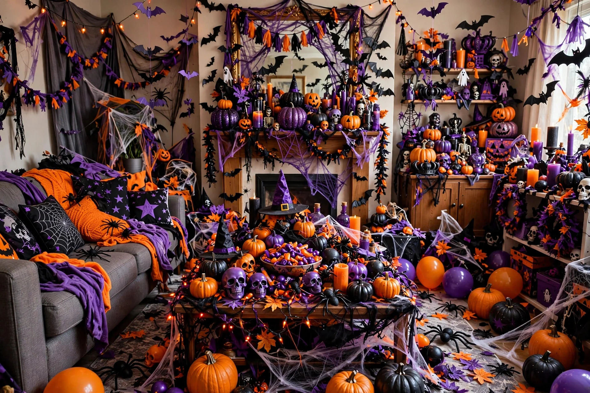
The biggest mistake is mixing every Halloween colour at once. Orange, black, purple, green, and blood red in the same room do not read as festive; they read as a clearance aisle. Pick two main colours and one accent at most. This is also how most common Halloween decorating mistakes start — not with one bad piece, but with five good pieces that were never meant to live together.
The second mistake is decorating every surface. When the mantel, the coffee table, the windowsills, and the shelves are all fully dressed, there is nowhere for the eye to rest, and the whole room feels smaller and messier. Leave some empty space on purpose. One strong vignette beats four crowded ones, and it is a lot easier to dust in November.
The third mistake is buying everything in one colour before you have tested it in your light. Orange looks very different under warm evening lamps than it does in a bright store, and cheap orange plastic can go almost neon at home. Buy one piece, live with it for an evening, and then decide whether to commit. And if you use fake spider webs, keep them sparse — a little web goes a long way, and a room buried in cotton webbing just looks dusty.
Finally, do not let either look take over rooms you actually need to use. A kitchen covered in decorations you have to move to cook dinner will annoy you by day three, and a bathroom full of spooky clutter is funny exactly once. Decorate the rooms you celebrate in, and leave the working rooms mostly alone.
7. Your Decision Checklist
Still torn? Run through this quick checklist and the answer usually picks itself.
Who is Halloween for in your house this year? If the answer is mostly kids or trick-or-treaters, lean orange and black. If it is mostly adults, a dinner party, or just you enjoying the season, lean neutral. How long will it stay up? If you decorate early or want pieces that last to Thanksgiving, neutral is the smarter investment. If it is a one-weekend effort, orange and black is cheaper and more fun.
What does your house already look like? Warm, traditional rooms absorb orange easily; minimal or modern rooms suit neutral better. And what is your budget this year? If it is tight, orange and black gives you the biggest impact for the least money, and there is no shame in that — some of the best porches I have seen cost less than twenty dollars.
Here is my honest answer, after years of trying both: most homes look best with a neutral base and a confident splash of orange. Keep the living room and mantel calm, let the porch go bold, and put one or two orange pieces wherever the eye naturally lands. You get the warmth and longevity of neutral, the fun and tradition of classic Halloween, and a house that still looks like yours. Whatever you choose, choose it on purpose, keep it to a few colours, and leave yourself one empty surface. Your November self will thank you.