There’s a specific October feeling I know too well: you step back from your decorated living room, and instead of “spooky and stylish” your brain says “why does this look like a Halloween store exploded in here?”
I know it because I’ve done it. More than once. The first year I really went for it, I bought two full bags of decorations, put every single one out, and my living room looked like a yard sale with a theme. My neighbor — the one with the effortlessly perfect porch — came over and very kindly said, “Wow, you really… committed.” I heard what she meant.
Here’s what I’ve learned since: cluttered Halloween decor is almost never about having too much stuff. It’s about a handful of specific mistakes — placement, color, scale, light — that make even good decorations read as mess. Fix the mistakes and the same decorations suddenly look intentional. Seven of them, with the fixes that actually work.
1. Decorating Every Single Surface
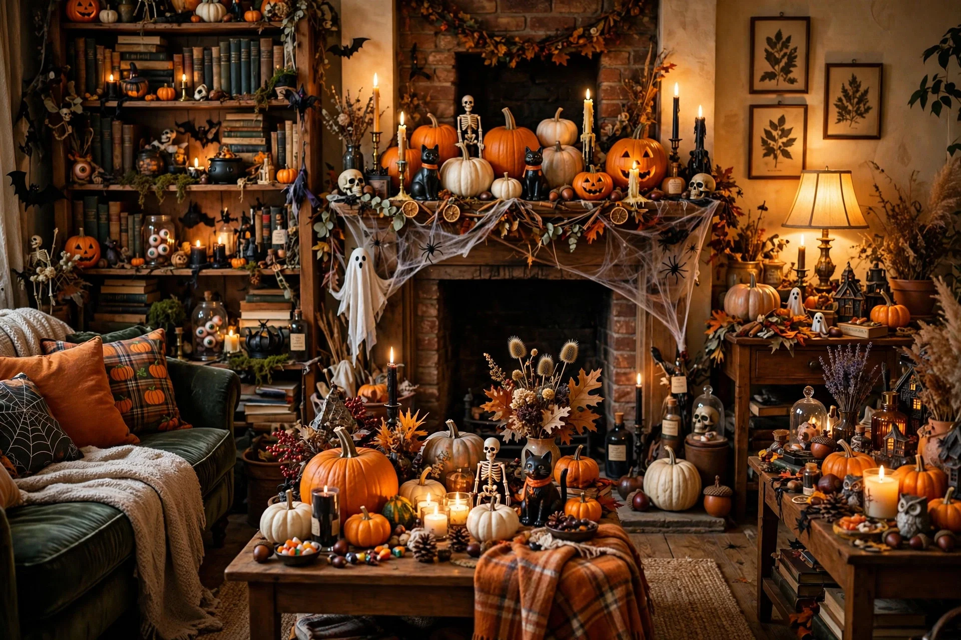
The mistake: The mantel, the coffee table, both side tables, the bookshelf, the windowsill, the top of the TV stand — all decorated, all at once.
This is the number one clutter-maker, and it’s pure visual math. When every surface is styled, the eye has nowhere to rest, and “nowhere to rest” reads as clutter no matter how nice the individual pieces are. Your brain processes it the same way it processes a messy room: too many things competing, no hierarchy.
The fix: Leave one surface in every room completely bare. I call it the “one surface off” rule. In my living room, the coffee table stays clean during October — no pumpkin, no candles, nothing. That single empty surface gives the whole room breathing room, and paradoxically makes the decorated surfaces look more deliberate. Try it: remove decor from one surface tonight and see how the room changes.
2. Mixing Four Color Schemes at Once

The mistake: Orange pumpkins next to purple lights next to green witch decor next to black everything, all in the same sightline.
Halloween has, let’s be honest, a chaotic official palette. The stores sell orange AND purple AND lime green AND black, so people buy all of it, and then it all lands in one room. Each color is fine alone. Together they vibrate — your eye bounces between them and the whole thing feels noisy and cheap, even when the pieces cost real money.
The fix: Pick two colors plus neutrals, and commit. My formula most years is black + one accent (burnt orange, or deep plum, or antique gold) with cream and wood tones as the neutrals underneath. Everything I buy or pull from storage has to pass the two-color test or it doesn’t go out. This single rule did more for my Halloween look than any purchase ever has — it’s the same discipline behind my tasteful Halloween decor ideas, where restraint is doing all the heavy lifting.
3. Buying Everything in One Trip From One Store
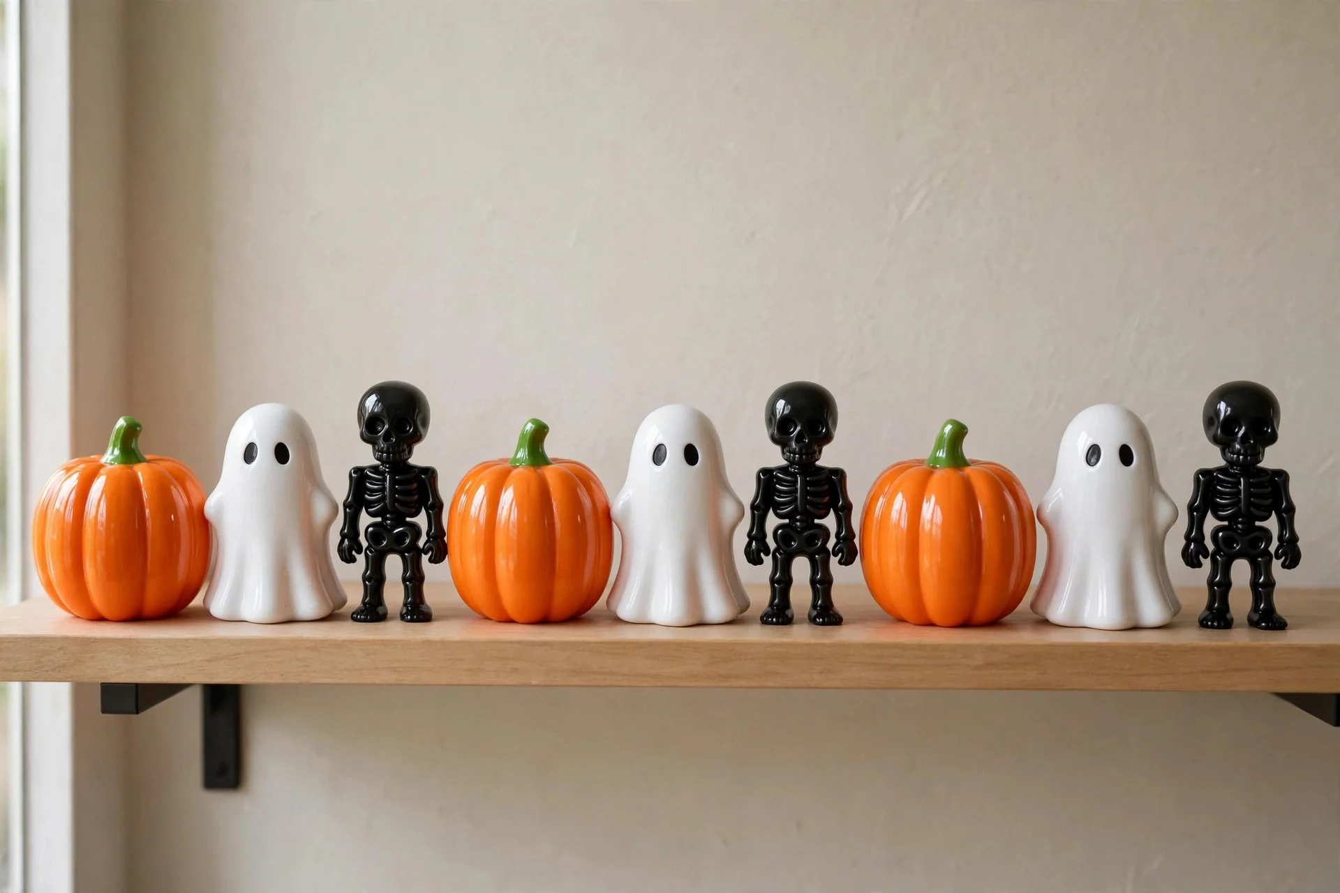
The mistake: One enthusiastic October shopping trip, one store, one cart — and now every decoration has the same finish, the same style, the same “I all came from the same shelf” energy.
There’s nothing wrong with budget finds (my dollar store Halloween guide is proof I love them). The problem is uniformity: when everything matches too perfectly, it reads as a display rather than a home. Real, interesting rooms are layered over time from different sources.
The fix: Mix at least three sources. Mine are usually: something from storage (last year’s), something natural (real pumpkins, branches, dried corn), and something new. The natural stuff is the secret weapon — a $4 real pumpkin next to plastic ones makes the plastic ones look better, because the real texture next to them sells the whole scene. One real element per vignette is enough.
4. The Scale Is All Over the Place
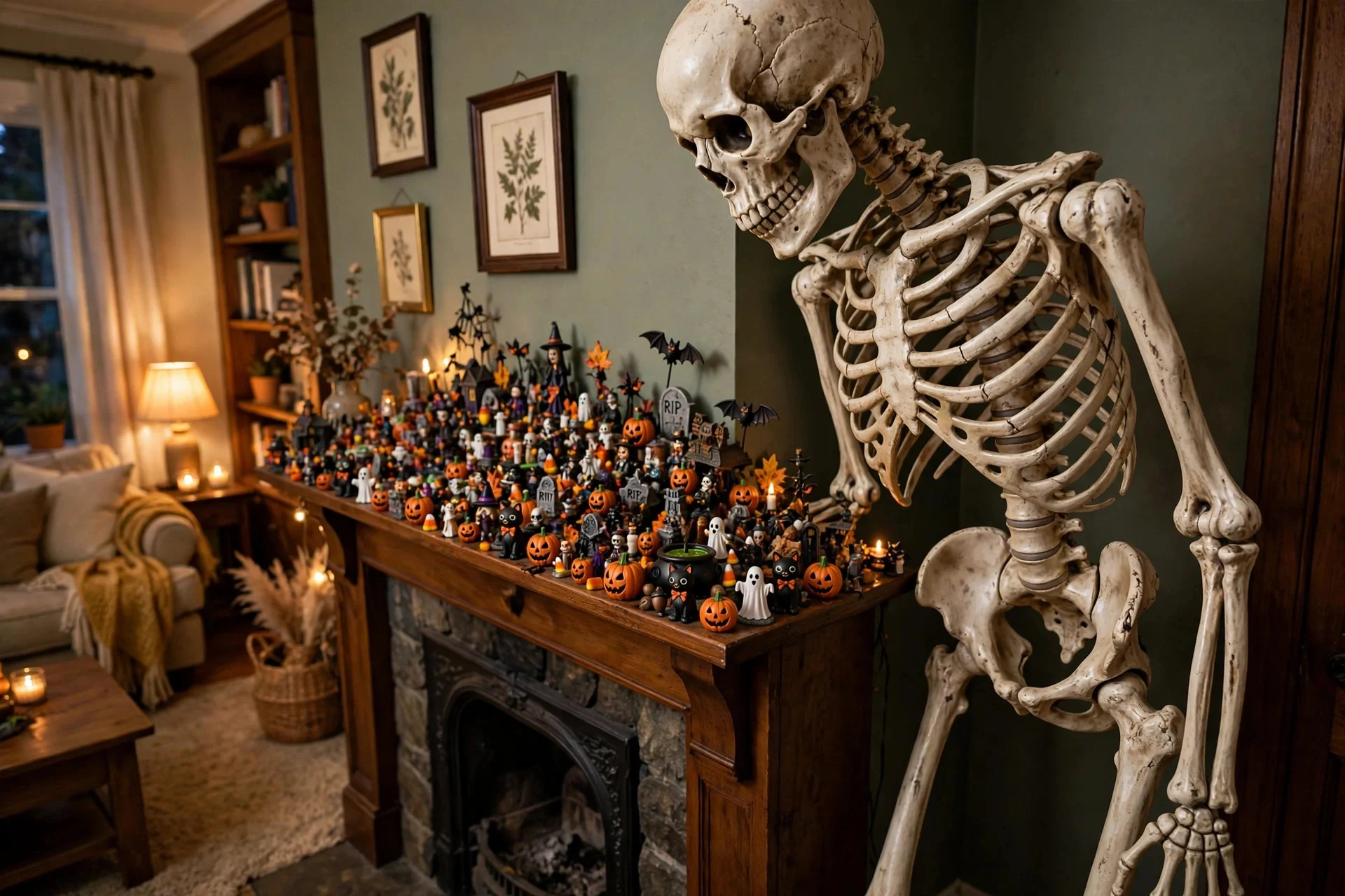
The mistake: A six-foot skeleton looming over a mantel crowded with two-inch figurines, with nothing medium-sized to bridge them.
Scale jumps are jarring. A giant piece next to tiny pieces with no middle ground makes both look wrong — the big thing looks like it’s invading, and the small things look like clutter you’d sweep off. This is why a shelf of mini pumpkins can look adorable while a shelf of mini pumpkins next to a giant skull looks like a storage problem.
The fix: Build in threes — small, medium, large — in every vignette. If you have the giant skeleton, give it medium companions: a stack of books, a lantern, a medium pumpkin. The medium pieces are the translators; they make the extremes make sense together. When I’m styling a Halloween mantel, I lay out the big anchor first, then fill the middle heights before adding anything small.
5. Too Many Focal Points Fighting Each Other
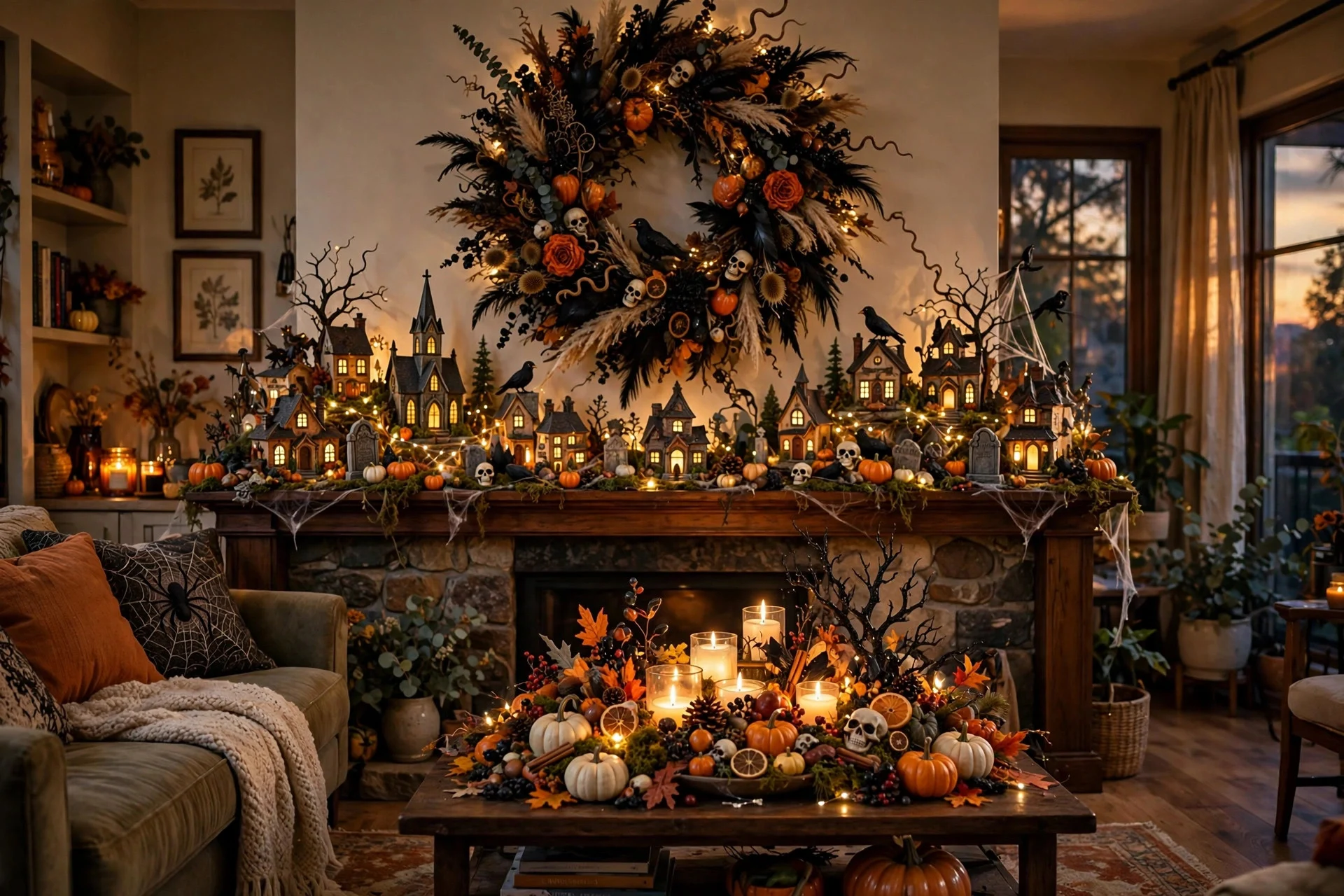
The mistake: A spooky village on the mantel AND a dramatic wreath on the wall above it AND a lit-up centerpiece on the coffee table AND a full porch scene visible through the window — all shouting at once.
Every “moment” you create asks for attention. Three or four big moments in one sightline and none of them wins; they just argue. This is the difference between a house that feels decorated and a house that feels busy.
The fix: One hero per room. Pick the single strongest display — usually the mantel, the porch, or the dining table — and let it be the star. Everything else in that room plays supporting: smaller, simpler, quieter. My living room hero is the mantel; the side tables get one candle each and that’s it. The porch gets its own hero separately, because it’s a different “room” visually. One star, one stage.
6. Decorating on Top of Everyday Mess
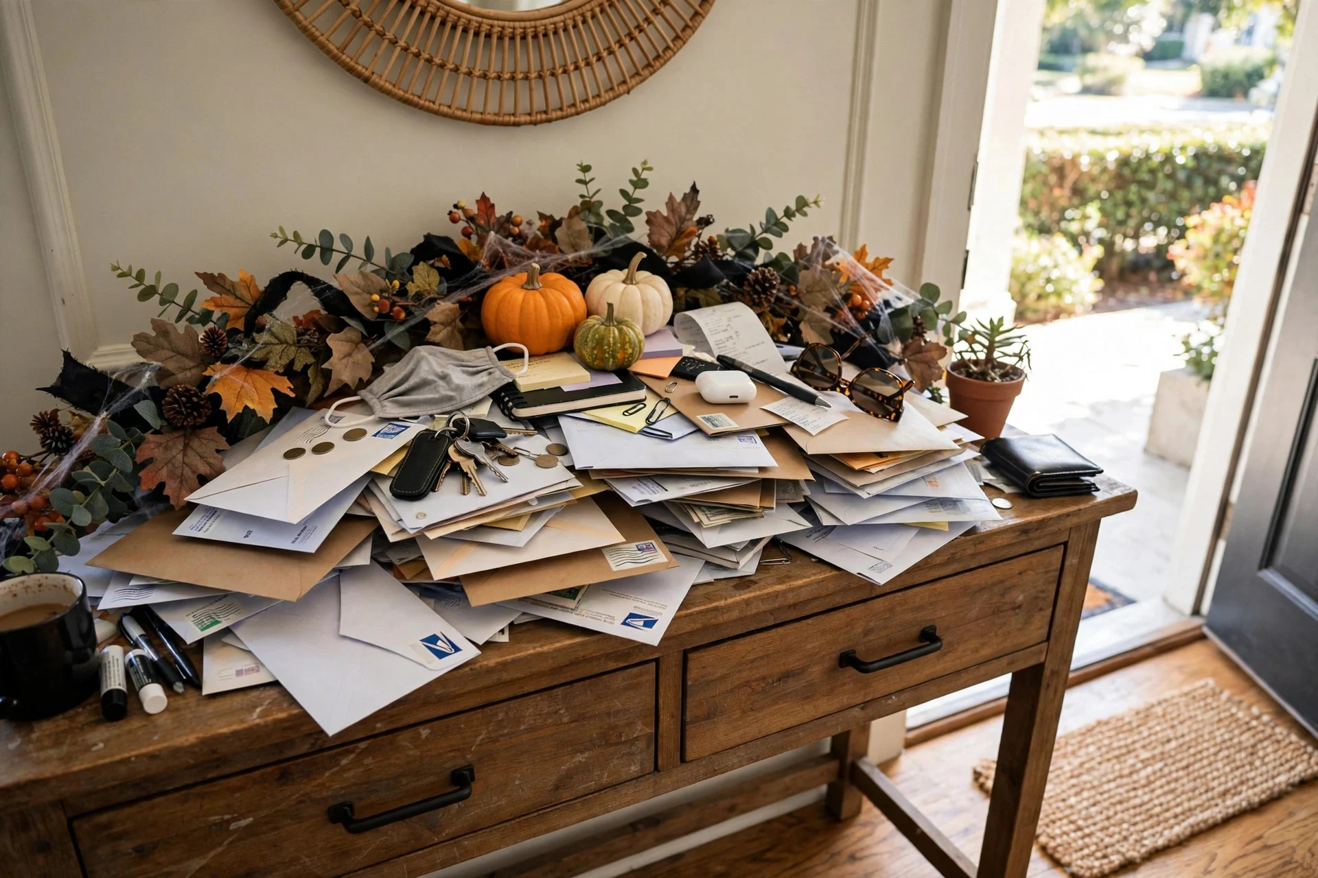
The mistake: The Halloween garland goes up over the mail pile. The spooky runner covers a stained tablecloth. Decor lands on clutter, and the clutter shows through.
This one stings because it’s so common and so invisible to the person doing it. Decorations don’t hide mess — they frame it. A beautiful vignette next to a pile of unopened mail just makes the mail look worse by comparison, and the whole surface reads as cluttered because, well, half of it is.
The fix: Clear first, decorate second. Fifteen minutes with a laundry basket: everything that doesn’t belong in the room goes in the basket, the basket goes in a closet, THEN the decorations come out. I do this every single October 1st before a single pumpkin appears. It’s the least fun step and the highest-impact one. Decorating a clean surface takes the same time as decorating a messy one, but the result looks twice as intentional.
7. Forgetting That Lighting Is Half the Decor
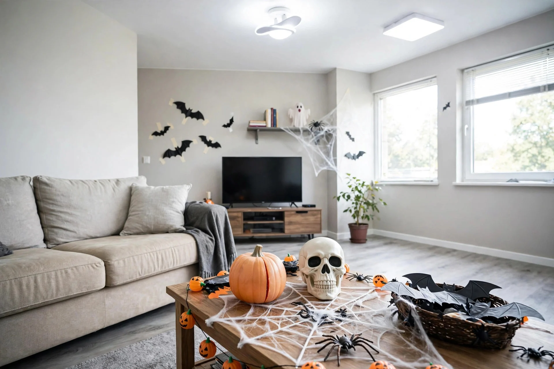
The mistake: All the decorations are up, and the room is lit like a dentist’s office — bright overheads washing everything flat.
Harsh light is the enemy of atmosphere and the great revealer of cheapness. Under bright white ceiling light, every plastic edge, every dust mote, every slightly-off color screams. The same decorations at dusk, lit by candles and one warm lamp, look moody and expensive. I’ve tested this: same mantel, overhead lights on versus off, and it genuinely looks like two different decorating jobs.
The fix: October lighting = overheads off, layers on. Candles (real or LED) at varying heights, one warm table lamp, and if you have them, string lights tucked behind things so the glow comes from nowhere obvious. This is the cheapest upgrade in this whole list — you probably own everything you need already. And if your porch is the hero, my last-minute porch ideas lean hard on exactly this trick.
None of these mistakes means buying new things. That’s the good news — every fix here is about editing, rearranging, or re-lighting what you already own. The cluttered look was never a stuff problem. It was a decision problem, and decisions are free to change.
Start with the easiest win: tonight, turn off the overheads, light three candles at different heights, and take one surface’s decor away completely. Then step back and look. I think you’ll see what I saw the year I finally stopped adding and started editing.
Frequently Asked Questions
How do I make Halloween decorations look classy instead of cluttered?
Limit your palette to two colors plus neutrals, leave at least one surface bare in every room, and light with candles and lamps instead of overheads. Restraint reads as classy; the decorations themselves matter less than the editing.
How much Halloween decor is too much?
When the eye can’t find a resting place, it’s too much. The practical test: photograph the room on your phone. If your eye bounces around the photo without landing anywhere, remove one thing from the busiest surface and shoot again.
What colors make Halloween decor look cheap?
No color is inherently cheap — it’s the combination that causes trouble. Orange, purple, lime green, and black all together in one sightline reads as noisy. Pick two, ground them with cream/wood/black neutrals, and everything looks more expensive.
Should Halloween decor match my home’s style?
Yes — that’s what separates “decorated home” from “seasonal display.” A modern minimalist home does Halloween best with black, white, and one accent; a farmhouse leans into natural pumpkins and dried botanicals. Work with your home’s existing palette, not against it.