Pick the colour scheme before you buy a single thing for Thanksgiving, and the rest of the table almost decorates itself. Pick it afterwards — after the runner, the napkins, and the candles are already home — and you end up with a table that is technically autumnal but somehow does not quite hang together. I learned that the hard way one year, when a beautiful rust-coloured runner went home with me and then fought with the burgundy napkins I already owned for the entire meal. Nothing was wrong with either colour. They just were not on the same team.
The good news is that there is no single “right” Thanksgiving palette. There are several good ones, and the best one for you depends on three very ordinary things: the dishes you already own, the light in your dining room, and how formal you want the evening to feel. This guide compares six palettes side by side — what each one looks like, who it suits, what to pair it with, and where it goes wrong — so you can choose in five minutes and then stop second-guessing. If you are building the whole table on a small budget, start with these Thanksgiving table ideas that cost almost nothing, then come back here and pick the colours to dress them in.
1. Classic Autumn: Burnt Orange, Gold and Deep Brown
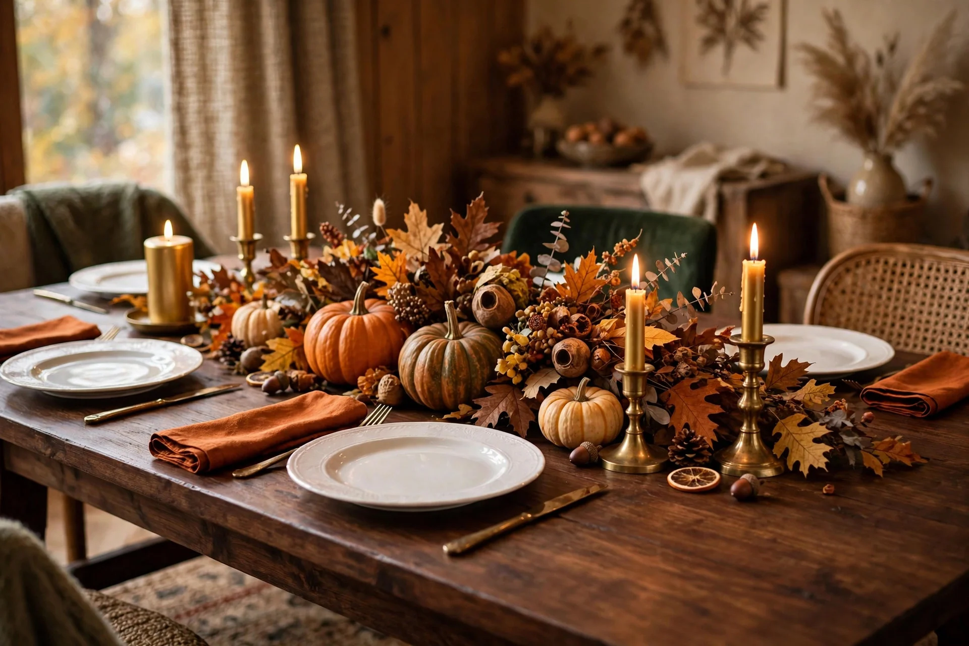
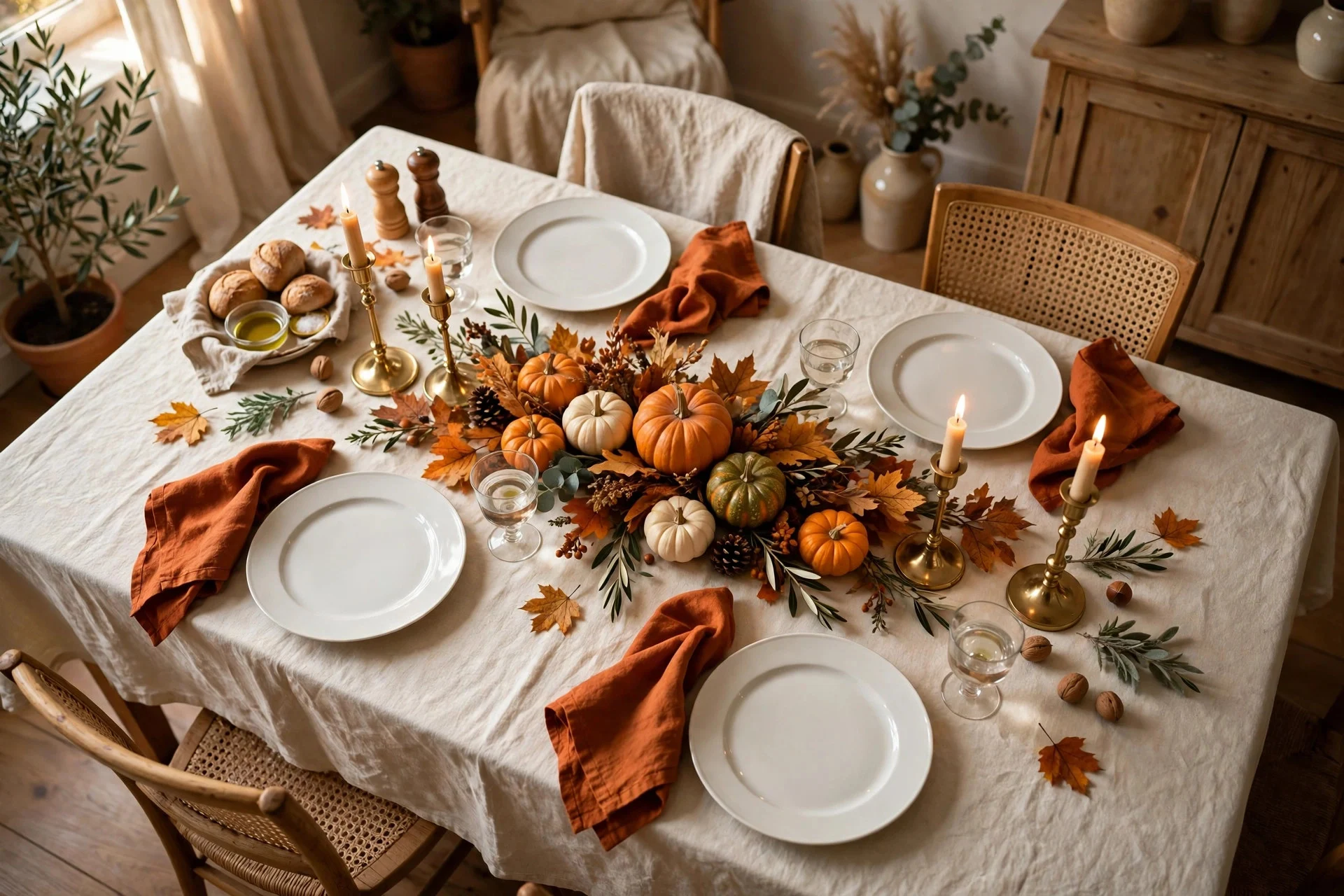
This is the palette everyone pictures when they hear “Thanksgiving” — burnt orange napkins, gold candlelight, deep brown wood, and a centrepiece full of pumpkins and dried leaves. It is warm, instantly recognisable, and almost impossible to get wrong, because every shop in November is selling exactly these colours. If you want your table to feel like the holiday the moment guests walk in, this is the safest bet.
It works best in rooms with warm wood, cream walls, and natural daylight, and it pairs beautifully with white or cream plates, because the plates give the strong colours somewhere to rest. The mistake to avoid is using all three colours at full strength everywhere — orange napkins, gold chargers, brown runner, orange centrepiece, gold candles. Pick one colour to lead, usually the orange, let gold appear in small touches like candle holders or cutlery, and keep the brown to wood and natural textures rather than dyed fabric. Two real pumpkins and a handful of dried leaves will do more than a bag of orange scatter decorations ever will. And if your table already leans traditional, this palette will feel like it was always meant to be there.
2. Warm Neutrals: Cream, Taupe and Soft Brown
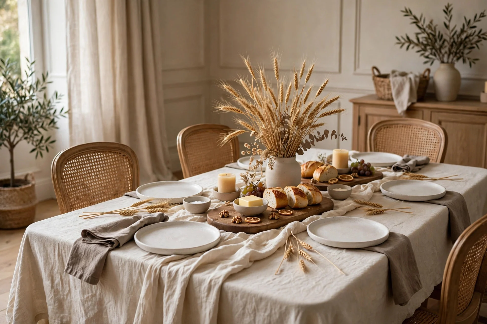
Warm neutrals are the quiet answer to Thanksgiving colour, and they suit people who find the classic palette a bit loud. Cream linen, taupe napkins, soft brown wood, and a centrepiece of wheat stalks or dried grasses give you a table that feels calm, expensive, and grown-up without shouting about the season. The food provides the colour here — golden turkey, green beans, cranberry sauce — and the table stays out of the way in the best possible sense.
This palette is a lifesaver if your plates are patterned or coloured, because neutrals will not compete with them, and it is the easiest palette to build from things you already own: a cream tablecloth, linen napkins in any pale shade, wooden boards and bowls. The risk is that it can look washed out if everything is exactly the same pale tone. Fix that with texture, not colour — a woven runner against smooth linen, matte ceramic against polished wood, a rough wheat bundle against a soft napkin. Add candlelight, which warms every neutral by a shade or two, and keep one slightly darker accent, like a deep brown serving board, to anchor the whole table. I used this palette the year my mother-in-law brought her patterned serving dishes, and it was the first time the table looked intentional rather than improvised.
3. Sage Green and Cream: The Calm, Modern Table
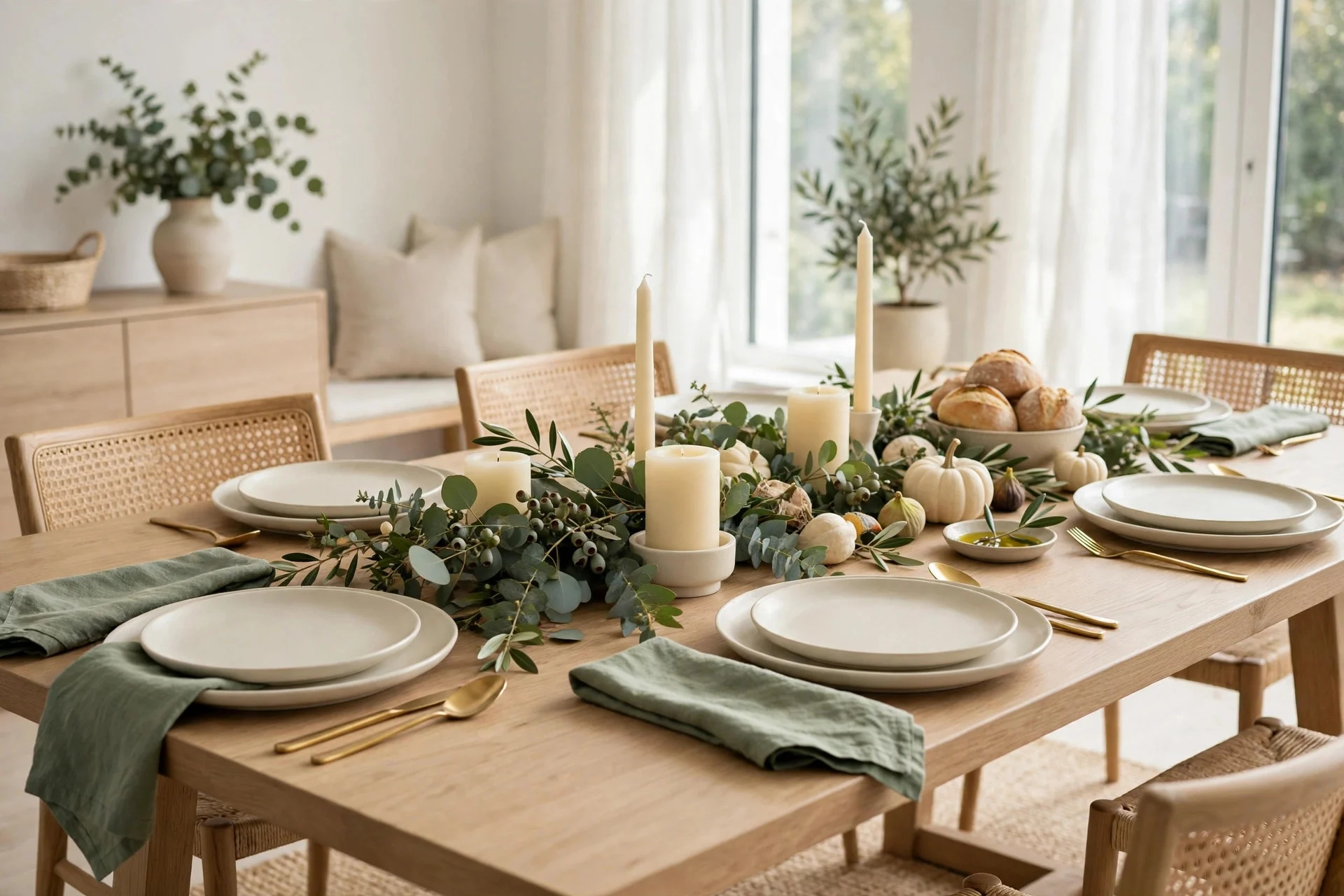
Sage green and cream is the palette for anyone who wants Thanksgiving to feel fresh rather than heavy. Sage napkins, cream plates, eucalyptus or olive branches down the centre, and plain cream candles give you a table that looks modern and calm, and it photographs beautifully in both daylight and candlelight. It is also the palette that transitions best into the rest of the year — nothing about it screams “November only.”
It suits lighter rooms, white or pale grey walls, and anyone whose everyday dishes are white, cream, or pale green. Pair it with natural textures — linen, wood, stoneware — and resist the urge to add orange “just for Thanksgiving,” because a single orange pumpkin will stick out like a traffic cone on this table. If you want a seasonal nod, use small white pumpkins or dried grasses instead; they keep the palette intact while still saying autumn. The one caution is that sage can look grey in a dark room, so if your dining room gets little natural light, add plenty of candles and keep the cream elements bright rather than ivory. Done right, this is the table guests describe as “so peaceful” — and on a busy holiday, peaceful is high praise.
4. Burgundy and Blush: Rich Without Being Loud
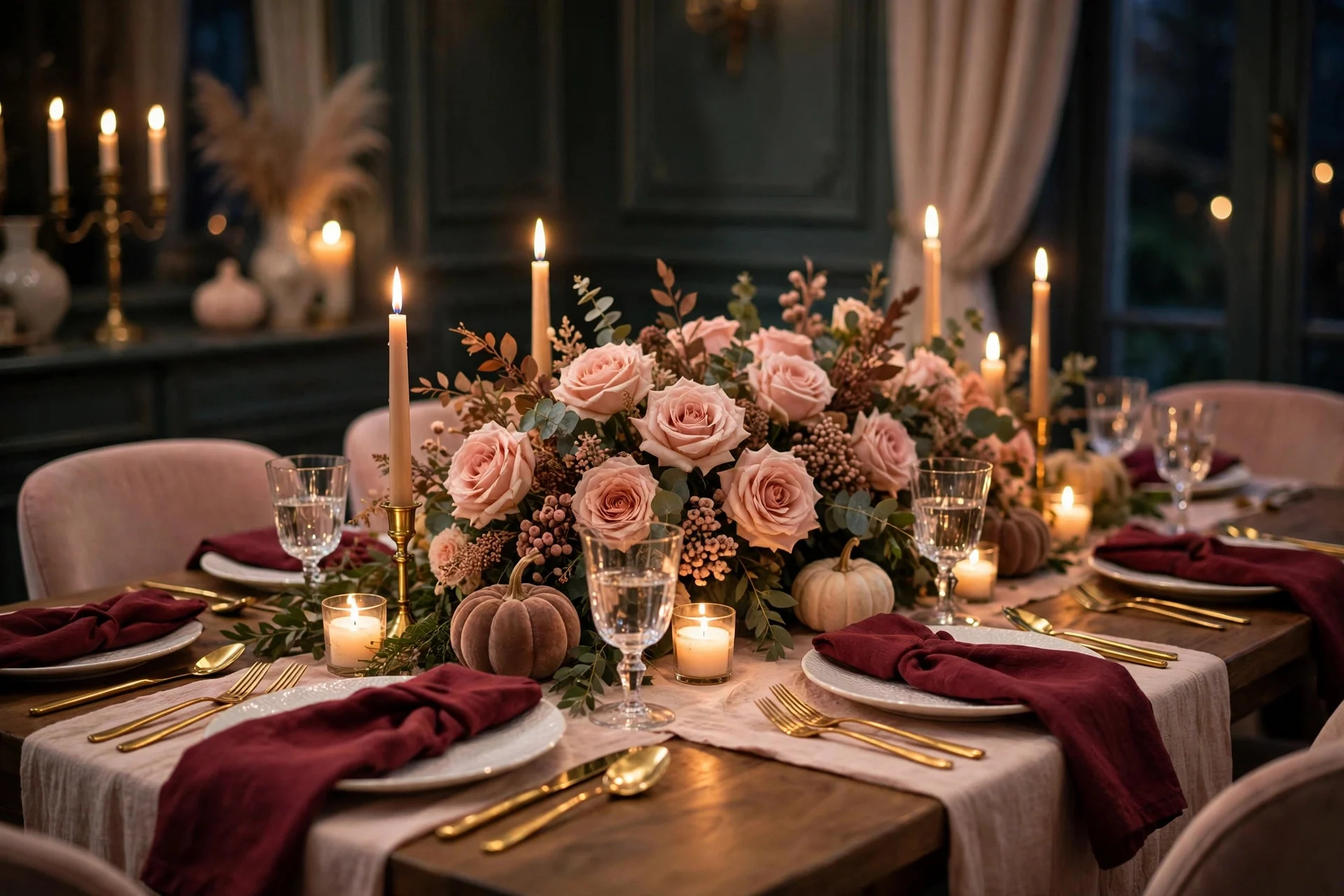
Burgundy and blush is the romantic of the six palettes. Deep burgundy napkins or a runner, soft blush flowers or candles, and a touch of gold cutlery give you a table that feels rich and celebratory without the full drama of red and gold. It suits evening meals especially well, when candlelight deepens the burgundy and softens the blush into something almost rose-gold.
This palette loves white plates, gold or brass accents, and a centrepiece of real flowers or dried roses rather than pumpkins — think a low bowl of burgundy dahlias or dried roses with a few blush candles around it. It is also forgiving if your room is on the darker side, because the deep colour holds up in low light instead of disappearing. The mistake is going too pink: blush should be the accent, burgundy the anchor, roughly two parts burgundy to one part blush. If the blush takes over, the table drifts towards Valentine’s Day. Keep the blush to flowers, candles, or a single layer of the napkin fold, and let the burgundy do the serious work. This is the palette I would choose for a smaller, candlelit Thanksgiving with close family, where the table is meant to feel like an occasion in itself.
5. Navy and Gold: The Evening Table
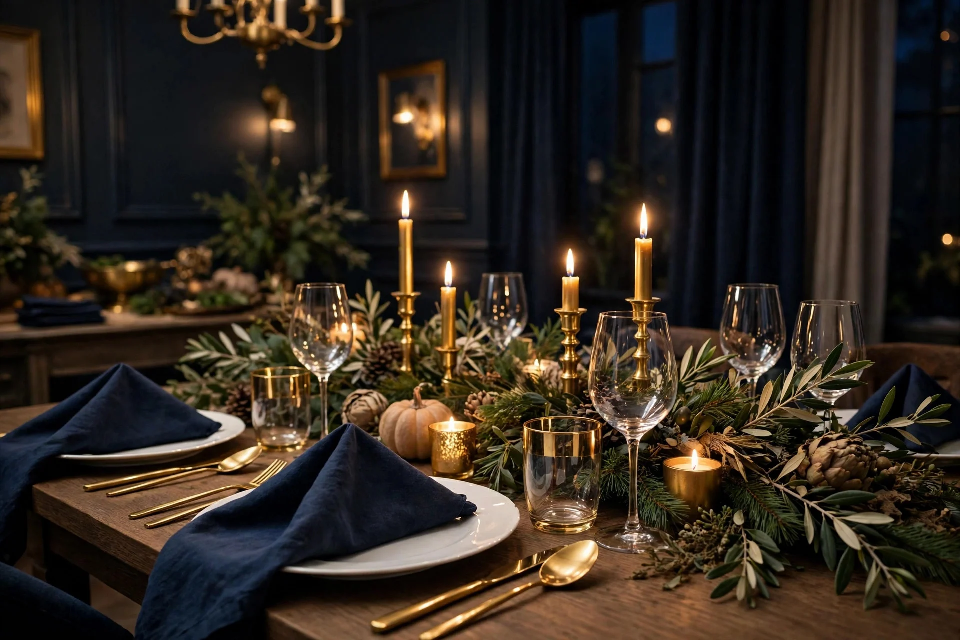
Navy and gold is the most formal palette on this list, and the one most people overlook for Thanksgiving — which is exactly why it stands out. Navy napkins, gold candle holders and cutlery, white plates, and a centrepiece of greenery with gold accents give you a table that feels like a proper dinner party, not just a family meal with extra leaves on it. It works beautifully for Thanksgiving because the deep blue reads as winter-evening without needing a single Christmas decoration.
It needs candlelight or warm lamps to work; in bright daylight navy can feel a bit serious, but once the candles are lit it glows. Pair it with white or cream plates — never patterned plates, which will fight the gold — and keep the greenery simple: eucalyptus, olive branches, or plain pine sprigs, with no orange or red mixed in. A word of caution: navy shows every crumb and water mark, so choose napkins and a runner you can wash easily, and wipe the table before guests sit down. If your Thanksgiving is an evening event, or if you simply like your table to feel dressed up, navy and gold will make the whole room feel like you tried harder than you actually did.
6. Harvest White and Pumpkin: Light, Bright, Still Seasonal
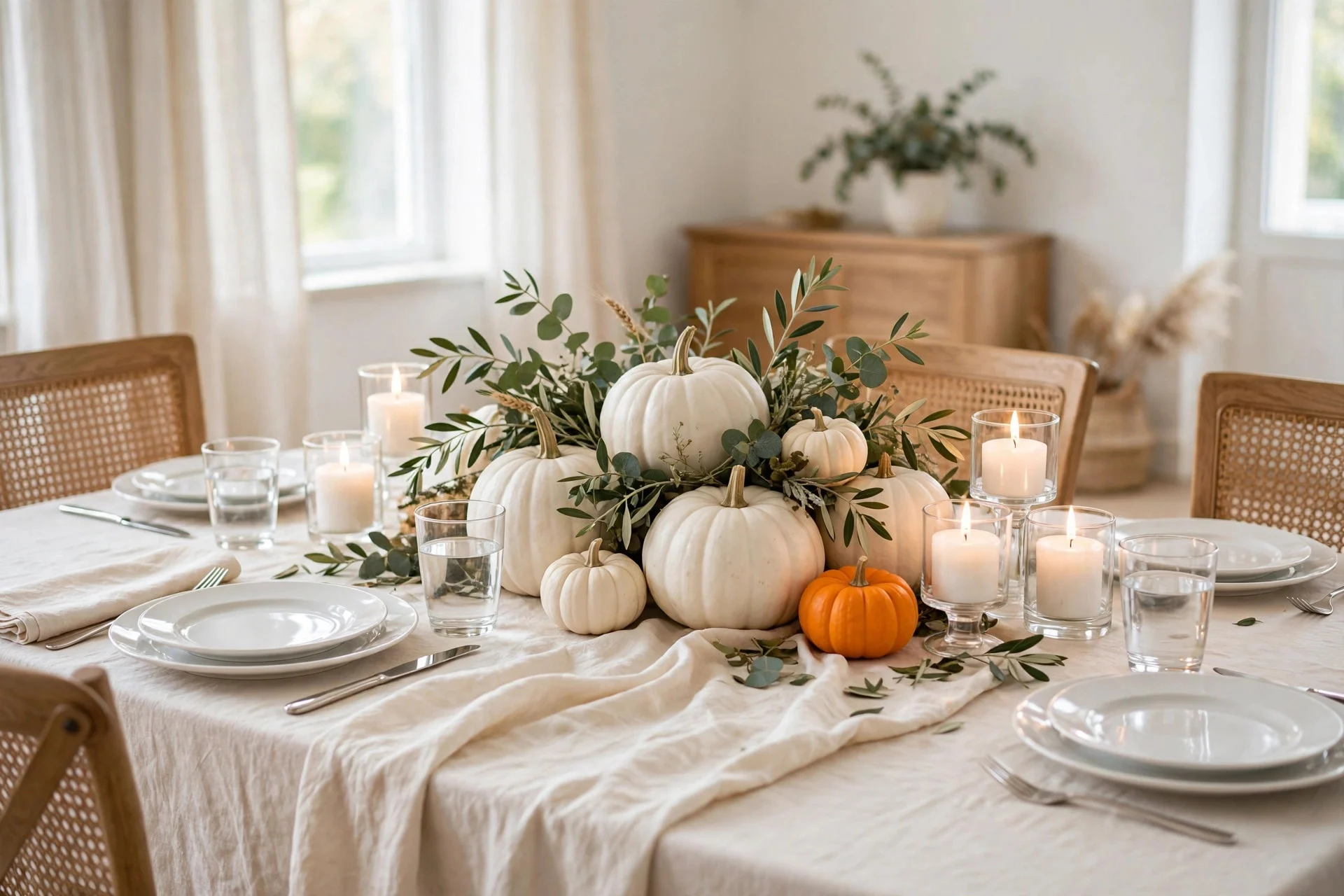
Harvest white is the palette for small or dark rooms, and for anyone who loves Thanksgiving but not heavy colour. White pumpkins, cream linen, white candles, and just a whisper of soft orange — a few dried leaves, one small orange pumpkin among the white ones — give you a table that feels bright, airy, and unmistakably autumnal. It is the palette that makes a small dining room feel bigger, because light colours reflect what light you have instead of absorbing it.
This one depends on layering white textures so it does not look like a blank table: a linen runner over a cotton cloth, ceramic pumpkins beside real ones, matte white candles beside glossy white plates. The soft orange accent matters more here than in any other palette — without it, guests may not register the season at all — but keep it to about one part in ten. A single orange pumpkin in a bowl of white ones, or a few dried orange leaves tucked into a white centrepiece, is enough. If you already own white plates and cream napkins, this palette costs almost nothing to build, which brings it close to the spirit of setting a table with the everyday dishes you already own. Just keep the candles unscented and low, so the brightness stays calm rather than stark.
Which Palette Suits Your Home? Pick in Five Minutes
Stop scrolling and answer three questions. First, what colour are your plates? White or cream plates suit all six palettes, so pick by mood; patterned or coloured plates point you towards warm neutrals or sage, which will not compete. Second, when do you eat? A daytime meal suits classic autumn, warm neutrals, sage, or harvest white; an evening meal suits burgundy and blush or navy and gold, which both come alive in candlelight. Third, how does your room feel? Warm wood and cream walls take classic autumn beautifully; pale, modern rooms suit sage or harvest white; darker rooms need the depth of burgundy or navy rather than pale colours that will wash out.
Whichever palette you land on, build it in this order: plates first, then the runner or cloth, then napkins, then candles, then the centrepiece. That order stops you buying a centrepiece in a colour nothing else matches, which is how most mismatched tables happen. And if you are still carrying autumn colours over from October, these ideas for switching from Halloween to Thanksgiving decor will help the rest of the room catch up with the table you have just chosen.
Three Mistakes That Wash a Palette Out
The first mistake is using every colour at the same strength. A palette needs a lead colour, a supporting colour, and an accent — if all three shout, none of them is heard. The second is buying the centrepiece first. Centrepieces are the most tempting purchase and the easiest to get wrong, because they set a colour the rest of the table then has to chase. The third is forgetting the light. Colours look different under daylight, warm lamps, and candlelight, so check your napkins and runner under the light you will actually eat in, not under the shop lights. A quick evening test — lay the runner and one napkin on the table, light a candle, and look — takes two minutes and has saved me from more than one well-meaning purchase.
None of this needs to be expensive, and none of it needs to be perfect. A palette is just a decision that makes every other decision easier, and the best Thanksgiving tables I have sat at were not the most expensive ones. They were the ones where somebody picked a direction — warm neutrals, sage, navy, whatever — and then let the food, the candles, and the people do the rest. Pick yours, set the table the night before if you can, and then stop fussing. The colour scheme has done its job; now it is time to enjoy the meal.