

People love saying, “Dark colours make rooms smaller.” IMO, that advice feels outdated. Moody colours blur edges, add depth, and create visual drama that tricks your eyes into seeing more space.
Ever noticed how a dark room feels cozy but expensive? That’s not magic—that’s contrast and light absorption doing their thing. When you style them well, these shades make small spaces feel intentional instead of accidental.
FYI: The secret sauce is lighting + finish + contrast. Get those right and you win 🙂
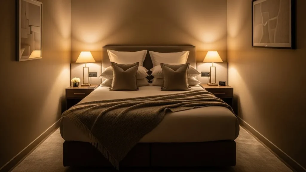
1. Deep Charcoal Gray – The Safe Moody Classic
I always recommend this first because it feels bold without being scary. Deep charcoal gray adds instant sophistication and hides awkward shadows like a champ.
Use it when you want drama without commitment issues. Pair it with white trim or light wood, and suddenly your tiny room feels tailored, not tight.
Ever wondered why hotels love this shade? Yeah—same reason.
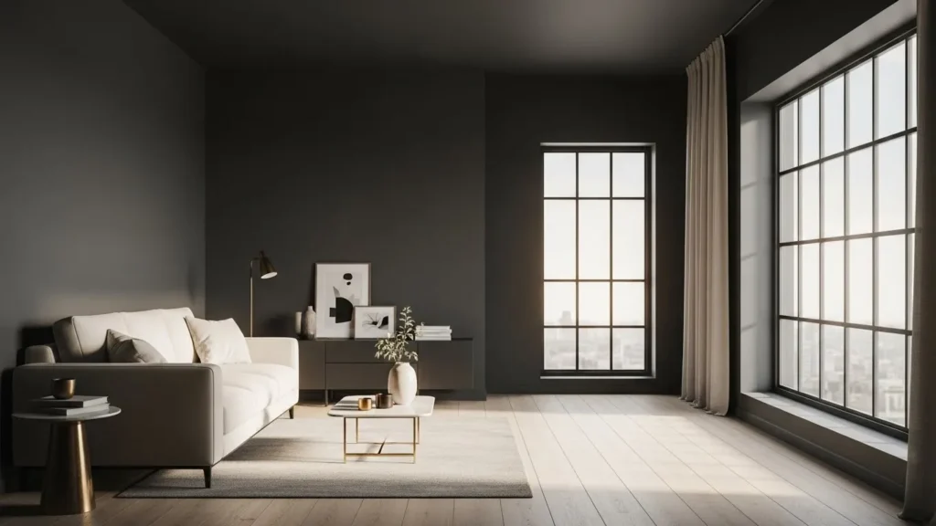
2. Graphite Black – Yes, Black Can Work
I know, I know. Black walls sound intense. But graphite black feels softer and more livable than pure black.

Use it in:
-
Powder rooms
-
Accent walls
-
Small offices
Add mirrors and metallic accents, and boom—luxury vibes without trying too hard.
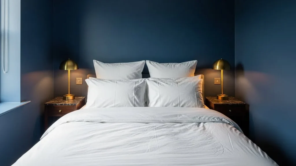
3. Navy Blue – Moody but Trustworthy
Navy feels like that friend who always shows up looking put-together. It adds depth without overwhelming the room.
I love navy in bedrooms and living rooms because it absorbs light in a calming way. Pair it with cream textiles or brass details and enjoy that “designer home” feeling.
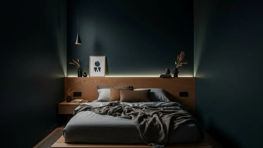
4. Midnight Blue – Navy’s Dramatic Cousin

Midnight blue goes deeper, richer, and moodier. It works beautifully in rooms with even a little natural light.
This shade:
-
Makes walls recede
-
Feels cinematic at night
-
Looks insane with warm lighting
Ever walked into a room and said “wow” out loud? This colour does that.
5. Blackened Teal – Bold Without Being Loud
Blackened teal mixes blue-green depth with softness. It feels creative, cozy, and slightly unexpected.
Use it if navy feels too safe but emerald feels too much. IMO, this shade thrives in creative spaces and bedrooms.
6. Dark Teal – Rich and Balanced
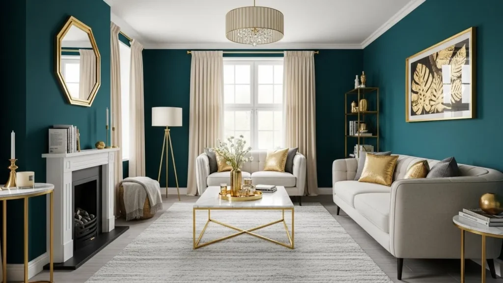
Dark teal adds color without screaming for attention. I love it because it adapts—bright during the day, moody at night.
Pair it with:
-
Cream curtains
-
Light oak furniture
-
Gold accents
Small room, big personality.
7. Ebony Green – Nature, But Make It Luxe
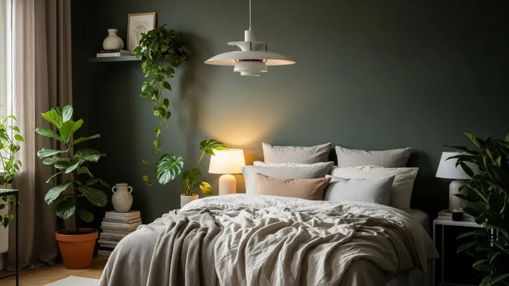
This one surprised me. Ebony green feels grounding, calm, and ridiculously elegant.
It works best in:
-
Bedrooms
-
Reading nooks
-
Dining spaces
Ever notice how nature never feels cramped? That’s the vibe this colour brings.
8. Slate Green – Soft Moody Energy
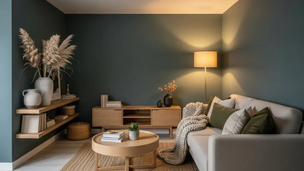
Slate green sits right between gray and green, which makes it insanely versatile. It adds mood without stealing attention from your decor.
If you love neutral spaces but want more depth, this shade hits that sweet spot.
9. Charcoal Olive – Understated and Chic
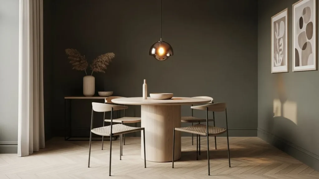
Charcoal olive feels grown-up. It doesn’t beg for compliments—it just quietly impresses.
Use it with linen fabrics and warm lighting to create a calm, expensive look. This colour works especially well in small living rooms.
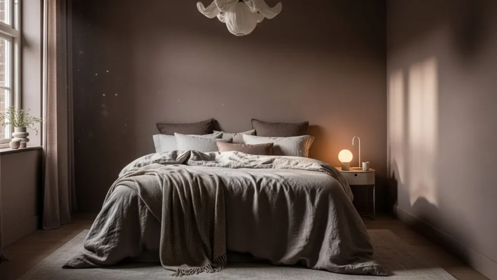
10. Espresso Brown – Cozy, Not Cave-Like
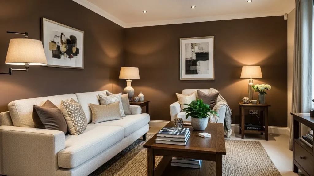
I once avoided brown walls like the plague. Turns out, I was wrong. Espresso brown feels rich and comforting when styled right.
Use lighter furniture and layered lighting so the room feels warm, not heavy.
11. Cocoa Truffle – Warm Luxury in Paint Form
Cocoa truffle adds softness to dark brown tones. It feels cozy but polished, like a boutique hotel room.
This shade loves texture—think woven rugs, linen curtains, and matte finishes.
12. Gunmetal Gray – Modern and Sleek
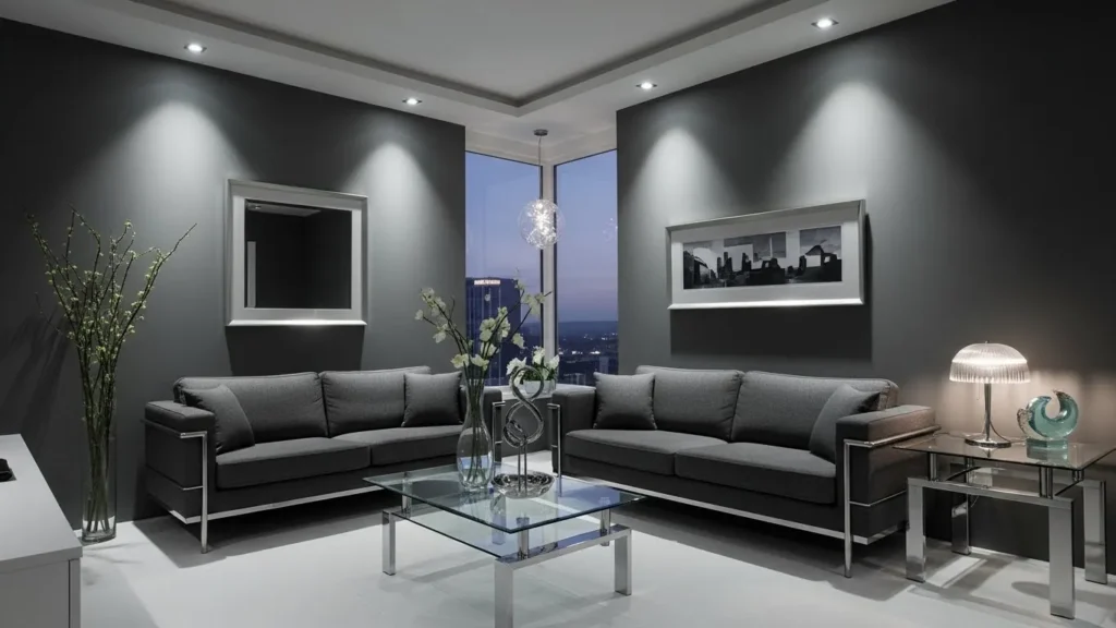
Gunmetal gray feels urban and cool without being cold. It works wonders in apartments and modern homes.
Add glass, chrome, or steel accents and let the walls do the heavy lifting.
13. Smoke Blue – Moody Without the Drama
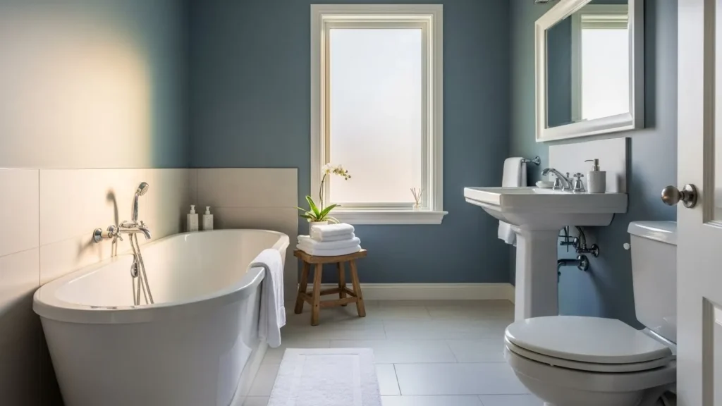
Smoke blue gives you mood without going full dark. It’s perfect if you want something softer but still elevated.
I love it in:
-
Bathrooms
-
Small bedrooms
-
Entryways
It whispers luxury instead of shouting it.
14. Deep Plum – Unexpectedly Elegant
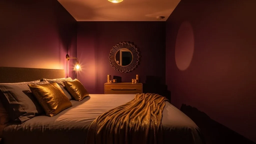
Plum scares people, but deep plum feels rich and dramatic, not childish. When you balance it with light decor, it feels stunning.
This shade shines in low-light spaces where you want intimacy and flair.
15. Dark Aubergine – Moody with Personality
Aubergine brings depth and creativity. It works beautifully in artistic spaces or cozy bedrooms.
Pair it with:
-
Cream trim
-
Gold accents
-
Soft lighting
Trust me—it feels high-end.
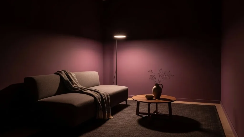
16. Smoky Mauve – Soft, Moody, and Chic
Smoky mauve blends pink, brown, and gray in a way that feels calm and stylish.
This colour works great if you want something moody but approachable. It never overwhelms, even in tiny rooms.
17. Merlot / Wine Red – Bold but Refined
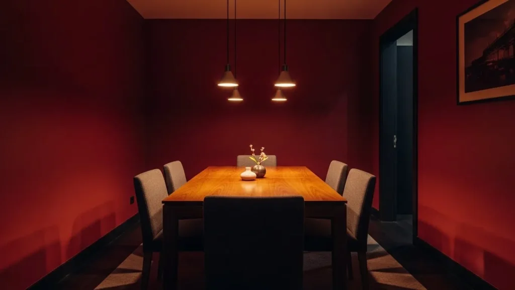
Wine red feels rich, warm, and confident. I love it in dining spaces and accent walls.
Keep the decor minimal so the colour shines. Too much clutter ruins the magic.
How to Make Moody Colours Feel Bigger (Not Smaller)
Here’s where people mess up. The colour isn’t the problem—the styling is.
Do This Every Time
-
Use lighter trim to define edges
-
Add mirrors to bounce light
-
Choose satin or eggshell finishes for subtle reflection
-
Layer lighting (overhead + lamps + accent lights)
Ever noticed how dark rooms feel bigger at night? Same concept—controlled lighting wins.
Final Thoughts: Small Room, Big Energy
Moody paint colours don’t shrink spaces—they shape them. They add depth, hide awkward corners, and make rooms feel intentional and luxurious.
If you’ve been playing it safe with beige walls, maybe it’s time to shake things up just a little. Worst case? You repaint. Best case? You fall in love with your space all over again 🙂
So tell me—which colour are you brave enough to try first?