
Introduction: Let’s Talk Cabinets (Because Yes, They Matter)
Ever walked into a kitchen and thought, “Wow… this feels expensive”—even when you know it probably wasn’t? Nine times out of ten, two tone kitchen cabinets did the heavy lifting. I’ve obsessed over kitchens way more than I’d like to admit, and IMO, this design choice never fails to steal the show.
If your kitchen feels flat, boring, or stuck in the early 2000s (ouch), two tone cabinets can fix that fast. They add contrast, depth, and personality without forcing you into a full renovation spiral. Ready to see why everyone suddenly loves them? Let’s get into it.
1. White Upper Cabinets with Dark Lower Cabinets
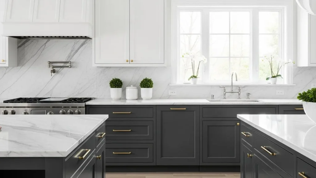
This combo feels like the little black dress of kitchen design. You can’t mess it up.
Why It Works So Well
White uppers keep the kitchen airy, while dark lowers ground the space. I’ve used this look before, and trust me—it hides scuffs like a champ.
Best color pairings:
-
White + navy
-
White + charcoal
-
White + espresso
Ever notice how kitchens instantly feel taller with light uppers? That’s no accident.
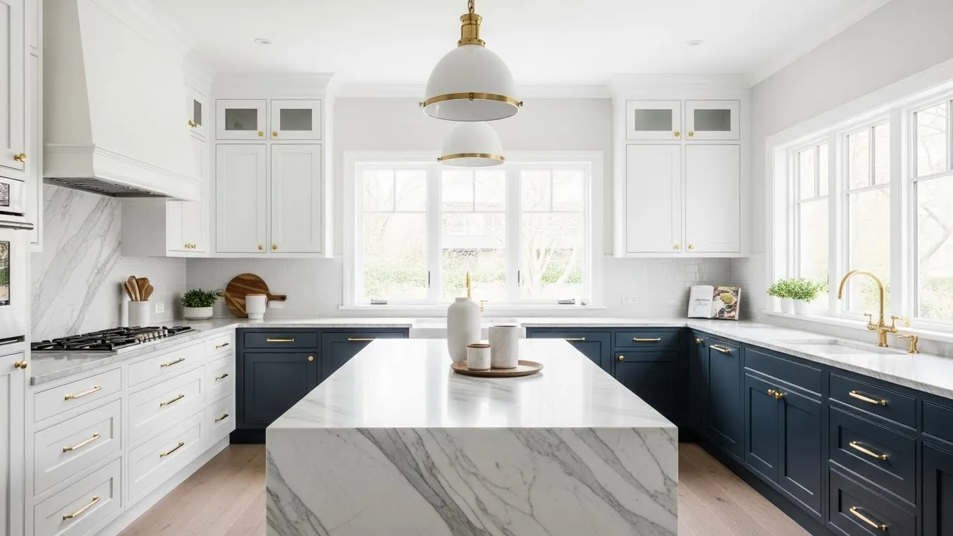
2. Navy and White for a Clean, Coastal Feel
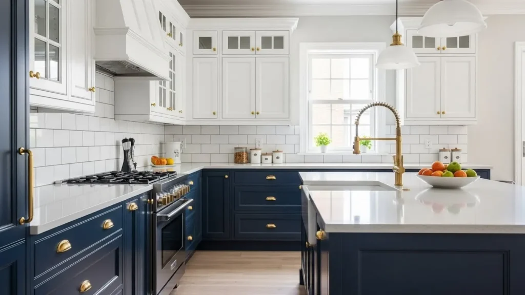
Navy cabinets scream confidence without being loud. Pair them with white, and boom—timeless elegance.
My Honest Take
I love navy because it feels bold but safe. It doesn’t age fast, and it plays nicely with brass hardware.
Style tip:
-
Navy on lower cabinets
-
White on uppers
-
Gold or brass handles for warmth
FYI, this combo photographs insanely well.
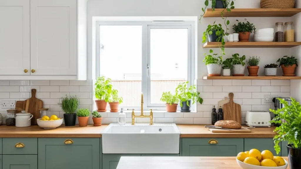
3. Wood Tone Lowers with Painted Uppers

If you love warmth but hate heavy kitchens, this one’s for you.
Why Natural Wood Wins
Wood adds texture that paint can’t replicate. I always recommend this for homes that feel a bit cold.
Popular pairings:
-
Oak lowers + white uppers
-
Walnut lowers + cream uppers
-
Maple lowers + soft gray uppers
Who doesn’t love a kitchen that feels cozy and modern?
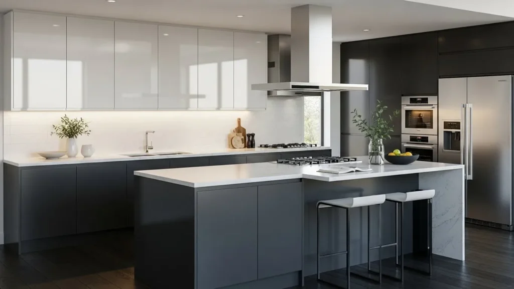
4. Black and White Cabinets for High Contrast Lovers
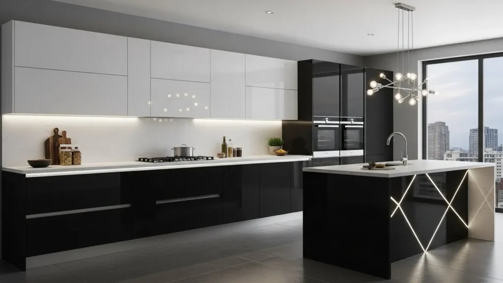
Yes, black cabinets work—and no, they won’t make your kitchen look like a cave if you do it right.
How to Nail the Look
Use black strategically. I usually suggest black lowers and white uppers to keep things balanced.
Quick wins:
-
Add under-cabinet lighting
-
Use glossy finishes to reflect light
-
Keep walls neutral
This look feels bold, sharp, and a little dramatic—in a good way 🙂
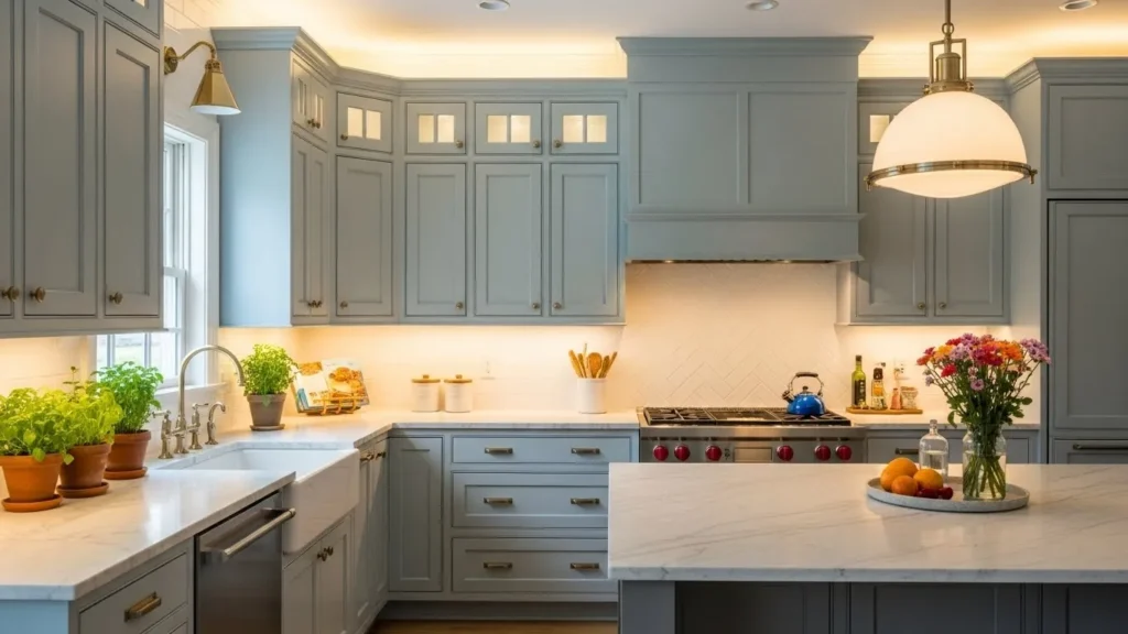
5. Soft Gray and White for a Subtle Upgrade
Not everyone wants drama, and that’s okay.
Why Gray Feels Safe
Gray gives contrast without screaming for attention. I recommend this combo to anyone scared of color.
Best shades:
-
Warm gray (not blue-gray)
-
Off-white instead of stark white
Ever wanted a kitchen that feels calm no matter how messy it gets?
6. Green Lower Cabinets with White Uppers
Green cabinets had a moment—and they’re still having it.
Why Green Feels Fresh
Green connects your kitchen to nature. I installed sage lowers once, and guests wouldn’t stop talking about them.
Top green shades:
-
Sage
-
Olive
-
Forest green
Add wood accents, and you’ve got magic.
7. Blue and Gray for a Modern Twist
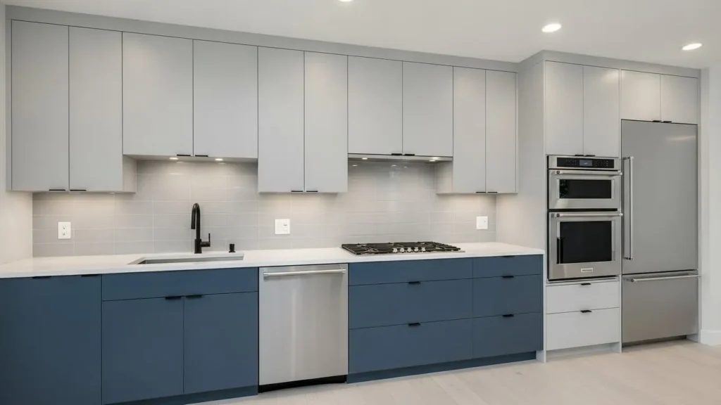
Blue and gray sound boring together, but trust me—they’re not.
When This Combo Shines
This pairing works best in modern kitchens with clean lines.
Design tips:
-
Blue lowers
-
Light gray uppers
-
Matte black hardware
Ever noticed how this combo feels calm but confident?
8. Cream and Beige for Warm Minimalism
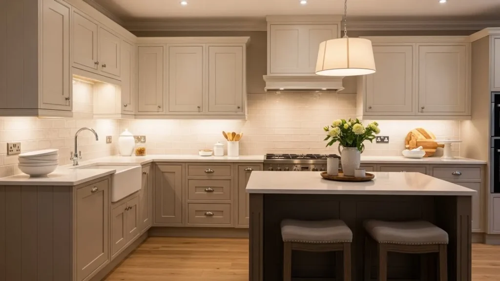
White isn’t the only neutral worth loving.
Why Cream Beats Stark White
Cream cabinets feel softer and more forgiving. I lean toward this when a space lacks natural light.
Pair with:
-
Beige lowers
-
Warm wood countertops
-
Soft gold hardware
This look whispers elegance instead of shouting it.
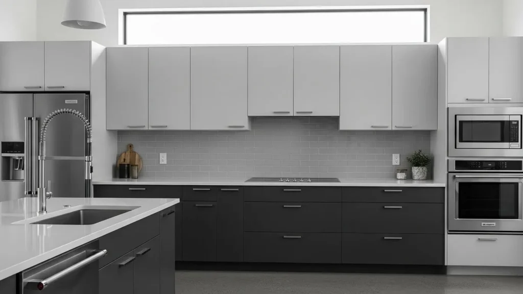
9. Charcoal and Light Wood for Modern Homes

This one feels straight out of a design magazine.
Why It Feels Luxe
Charcoal brings drama, while wood keeps it human.
Perfect for:
-
Open-plan homes
-
Minimalist kitchens
-
Matte finishes
Would you believe this combo hides fingerprints better than most?
10. Pastel Uppers with Neutral Lowers
Yes, pastel cabinets can look grown-up. I promise.
How to Keep It Classy
Use soft pastels only on uppers and ground them with neutrals below.
Try these combos:
-
Blush + gray
-
Pale blue + white
-
Mint + wood
This works great if you want personality without commitment.
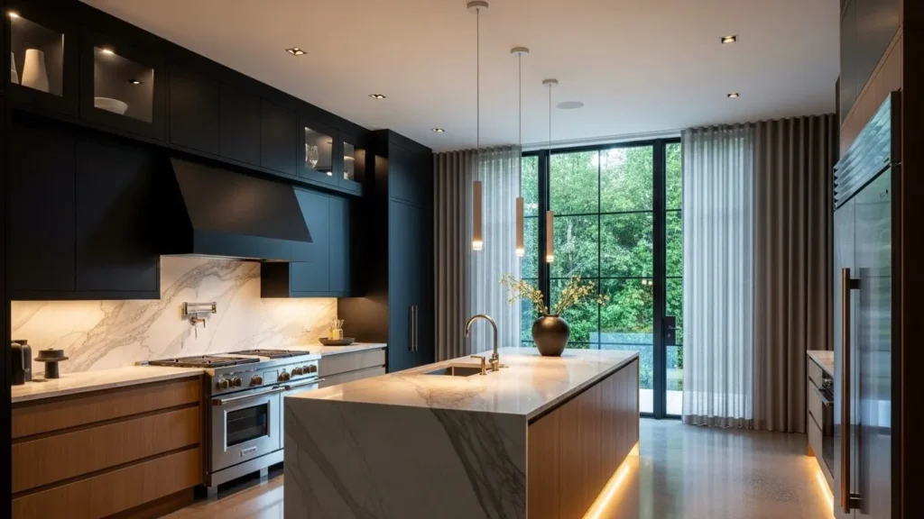
11. Matte Black and Wood for Bold Souls
This one isn’t for the faint-hearted—and that’s why I love it.
Why Matte Black Hits Different
Matte black feels modern and luxurious without being flashy.
Design rules:
-
Use wood to soften the look
-
Keep countertops light
-
Add plenty of lighting
Ever wanted a kitchen that feels edgy but warm?
12. Two Shades of the Same Color
Contrast doesn’t always need different colors.
Why This Feels Cohesive
Using two tones of one color creates depth without chaos.
Examples:
-
Light blue uppers + navy lowers
-
Soft gray uppers + charcoal lowers
This trick feels subtle but powerful.
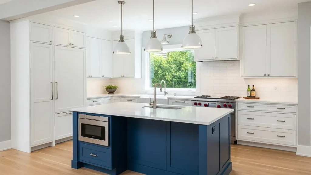
13. White Cabinets with a Bold Island
Sometimes the island deserves attention.
Why This Layout Works
Keeping perimeter cabinets white lets the island shine. I’ve seen teal, navy, even emerald islands steal the show.
Island color ideas:
-
Deep blue
-
Forest green
-
Charcoal
Isn’t it fun to break the rules a little?
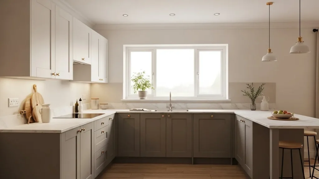
14. Warm Taupe and White for Timeless Appeal
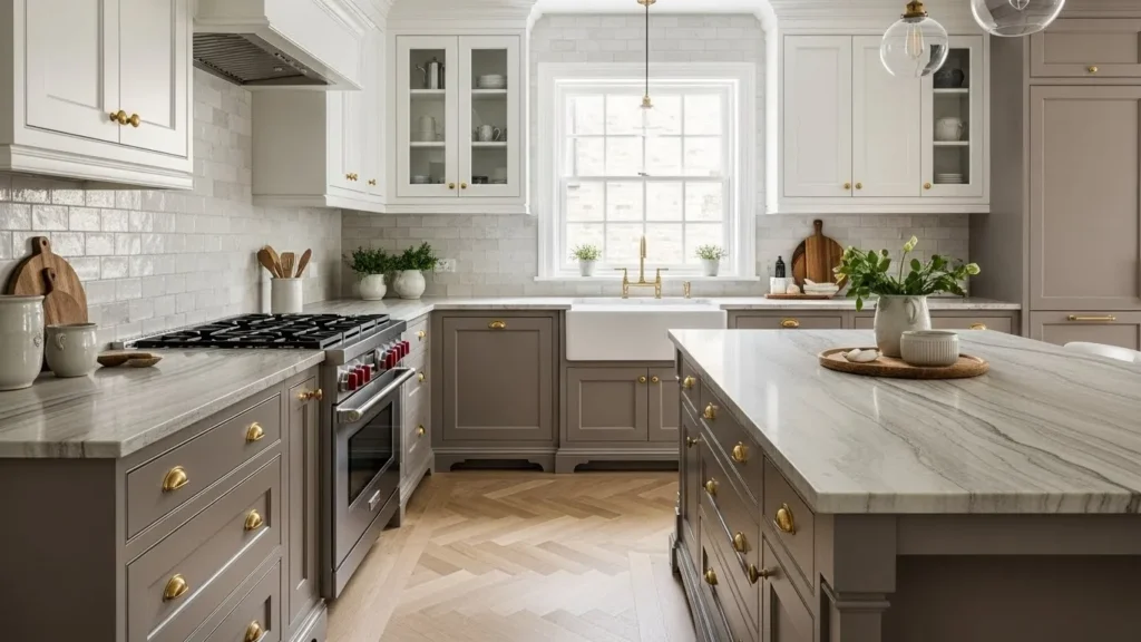
Taupe doesn’t get enough love.
Why Taupe Works
It sits perfectly between gray and beige, making it incredibly versatile.
Pair with:
-
White uppers
-
Stone countertops
-
Warm metal accents
This combo never feels trendy—and that’s the point.
15. Mixed Finishes for a Designer Look
Color isn’t the only way to go two tone.
Think Beyond Paint
Mixing finishes creates contrast without color overload.
Ideas to try:
-
Glossy uppers + matte lowers
-
Painted uppers + wood lowers
-
Textured lowers + smooth uppers
IMO, this feels very “designer secret.”
Conclusion: So… Which One’s Your Favorite?
Two tone kitchen cabinets aren’t just a trend—they’re a smart design move. They add contrast, personality, and visual interest without overwhelming your space. Whether you love bold drama or soft neutrals, there’s a combo that fits your vibe.
If your kitchen feels tired, this might be the refresh you didn’t know you needed. So go ahead—mix those colors, break a rule or two, and create a kitchen you actually enjoy hanging out in. Because let’s be honest… that’s where everyone ends up anyway 😉